08 / 15Web3 / mobile FinTechDubai
Web3 Mobile App DeFi FinTech

GeekWallet

Designed a multi-chain FinTech wallet for a Dubai-based decentralised finance company — simplifying wallet creation, portfolio tracking, receiving assets, cross-chain trading, dApp access, and NFT discovery for users new to crypto.
Client
DeFi Platform · Dubai, UAE · Confidential
My Role
Lead Product Designer
Platforms
Web · iOS · Android
Focus Areas
User Research · IA · Mobile UX · Design System · Prototyping
GeekWallet — product overview
GeekWallet / Selected product view
3
Platforms designed (web, iOS, Android)
2
Core user groups: first-time holders & crypto-native users
AA
WCAG accessibility compliance
4
Core wallet journeys prototyped
Problem
Wallet jargon and irreversible actions made DeFi intimidating for first-time crypto users.
Ownership
Research, information architecture, mobile UX, prototyping, and accessible design system.
Constraints
Serve beginners and crypto-native users across web, iOS, and Android within a confidential engagement.
Outcome
Four core wallet journeys prototyped with WCAG AA accessibility across three platforms.
01

The Design Challenge

Crypto wallets have a serious accessibility problem. Blockchain jargon, intimidating confirmation flows, irreversible transactions, and the fear of making a costly mistake keep the majority of potential users away from DeFi entirely.

This Dubai-based client was building a decentralised wallet targeting a dual audience: crypto-native power users who wanted full control, and first-time crypto holders who needed guidance.

"If a non-technical person can't buy their first crypto in under 3 minutes, we've failed."
— DeFi Product Lead

The core design tension: advanced DeFi functionality (staking, liquidity pools, multi-chain swaps) needed to coexist with a consumer-grade onboarding experience that felt closer to Revolut than MetaMask.

I handled the full design lifecycle — user research, IA, wireframing, high-fidelity design, and interactive prototypes — across web and mobile.

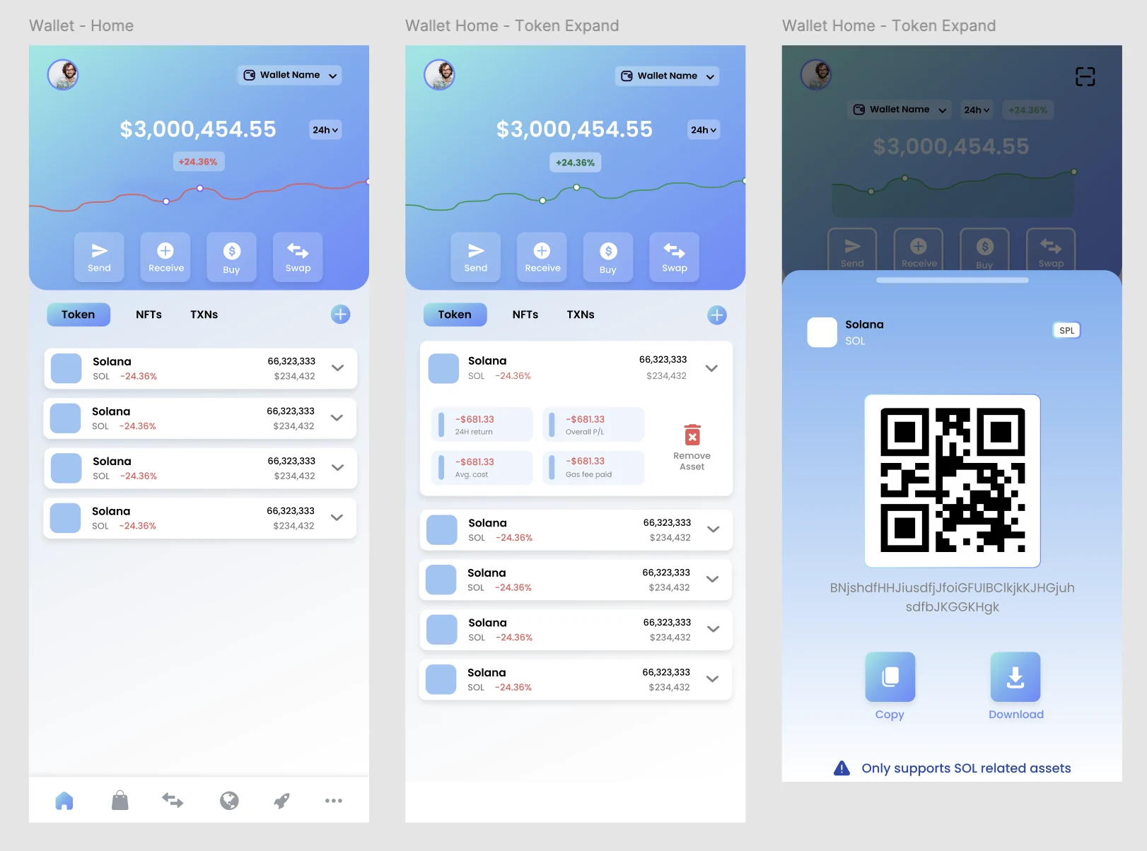
Three mobile wallet screens showing the portfolio home, expanded token details, and a receive-assets QR flow
Wallet Home & Receive · Balance, token performance, everyday actions, and wallet address sharing brought into one familiar mobile pattern
02

Research Insights

😰
Fear of Irreversibility
All 8 non-technical research participants cited fear of sending funds to the wrong address as their primary barrier. The UX needed to make confirmation feel safe, not alarming.
🧩
Jargon Overload
Terms like "gas fees," "seed phrase," and "liquidity pool" caused immediate drop-off in testing. Progressive disclosure of technical complexity was essential.
📲
Mobile-First Behaviour
82% of research participants said they'd primarily use a mobile app. The mobile experience needed to be the primary design direction, not an afterthought.
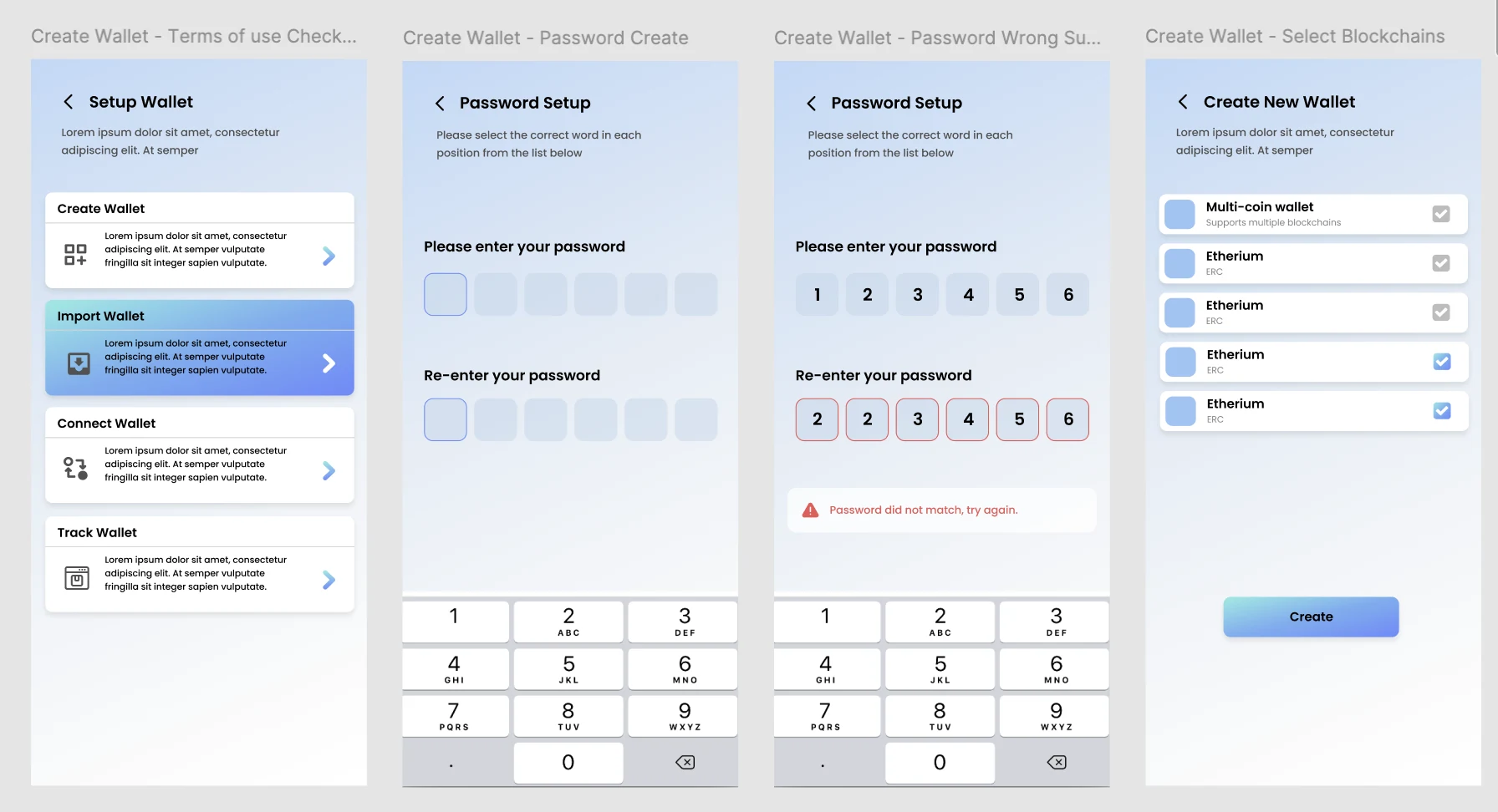
Four mobile screens showing wallet setup options, PIN creation and blockchain selection
Guided Wallet Setup · Clear choices for creating, importing, connecting, or tracking a wallet, followed by PIN setup and network selection
03

Key Design Decisions

01
Guided Onboarding, Not One Generic Path

Separated create, import, connect, and watch-only journeys at the first decision point. A short PIN setup and explicit blockchain selection give users control without forcing them to understand the complete technical model upfront.

02
Confidence-Building Transaction Flows

Designed a 3-step send flow with an address confirmation screen showing a visual checksum and ENS name resolution. Added an optional "test transaction" prompt for first-time sends. Clear fee display in fiat equivalent before, not after, confirmation — eliminating the surprise gas fee problem.

03
One Trade Hub Across Chains

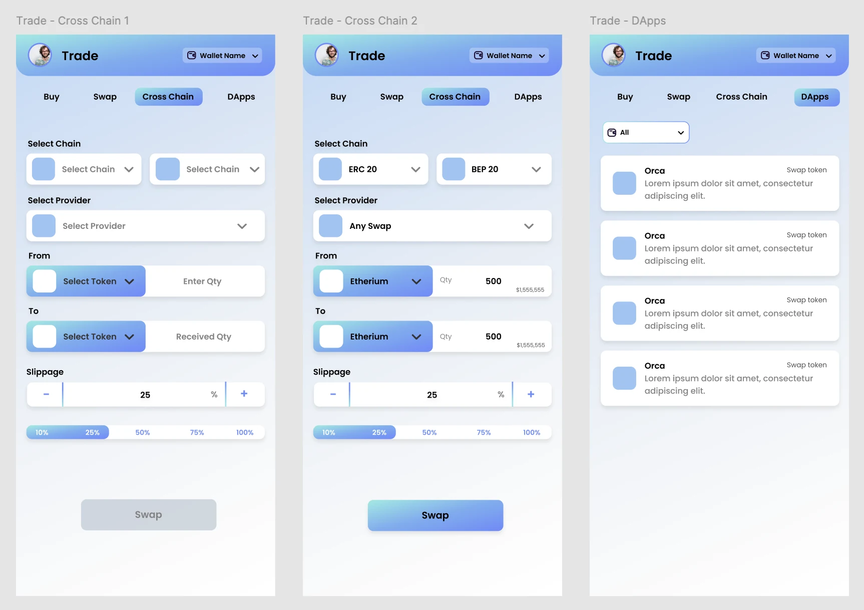
Combined buy, swap, cross-chain, and dApp discovery under one trade destination. Chain, provider, token, quantity, slippage, and estimated value follow a clear top-to-bottom sequence so users can understand what will happen before committing.

04
Touch-First Mobile Design

All interactive elements meet 44×44pt minimum touch target requirements. Bottom-sheet patterns for action confirmation keep critical actions in thumb reach. Bottom navigation optimised for one-handed use — the most common posture for mobile financial apps.
WCAG AA Touch Target Standards HIG Guidelines Material Design
Three mobile screens showing cross-chain token selection, swap configuration and decentralised app discovery
Cross-Chain Trading · A progressive flow from empty state to configured swap, with dApps accessible in the same task-focused workspace
04

Deliverables

📐
User Research Report
8 qualitative interviews + competitive landscape analysis. Synthesised into a persona set and prioritised design principles for the team.
🗂
Full IA + Flows
Complete information architecture across web and mobile, covering 40+ screens and 8 core user flows including onboarding, send/receive, swap, and staking.
📱
High-Fidelity Prototypes
Interactive Figma prototypes for both iOS and Android — click-through for key flows, used for investor demos and developer handoff.
Beyond Transactions

A wallet that supports discovery

The product direction extended beyond storing and trading tokens. I designed an NFT destination that gives users a clear entry point into market activity—global statistics, upcoming projects, top sales, hot bids, and live auctions—without making the wallet home feel overloaded.

The same mobile design language carries across finance and discovery: compact cards, strong hierarchy, familiar filters, and contextual wallet controls.
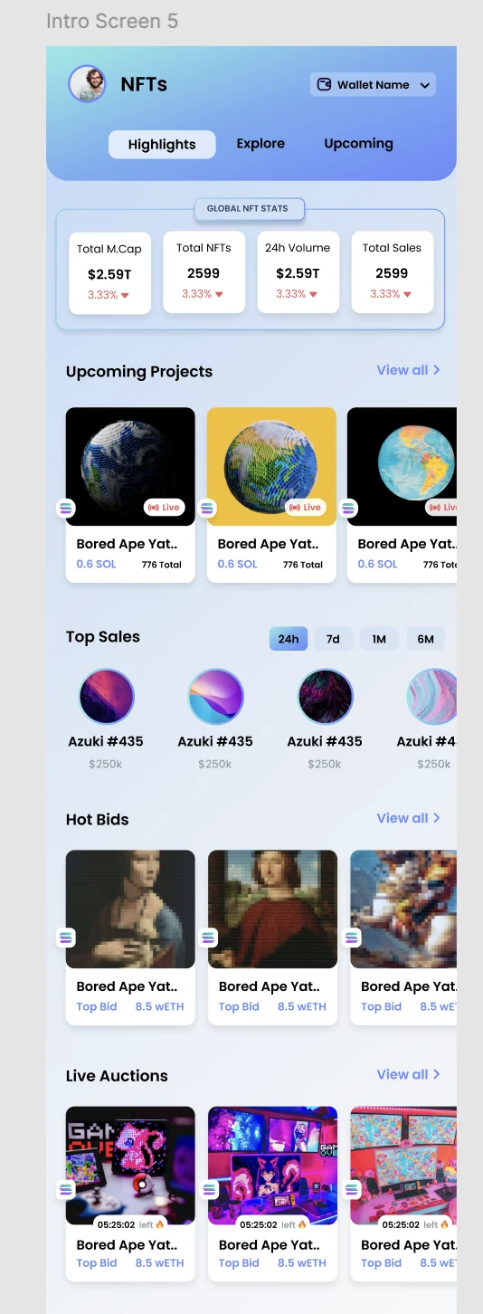
Mobile NFT discovery screen showing market statistics, upcoming projects, top sales, hot bids and live auctions
NFT Discovery · Market context and collection activity organised into a scannable mobile feed

Have something in mind?

Let's make it work.

Ex-Founder, Product Manager & Designer. Based in Dubai.