End-to-end case studies led by AI-native product thinking—spanning AI platforms, SaaS, FinTech, EdTech, Web3, and enterprise systems from zero-to-one through scale.
Conceived, designed, and built an AI-native email client during the Antler MENA cohort through an end-to-end AI-first product workflow.
Designed for Superpage: one checkout that routes each customer payment to the correct vendor and gives operators a clear view of fees, failures, and settlements.
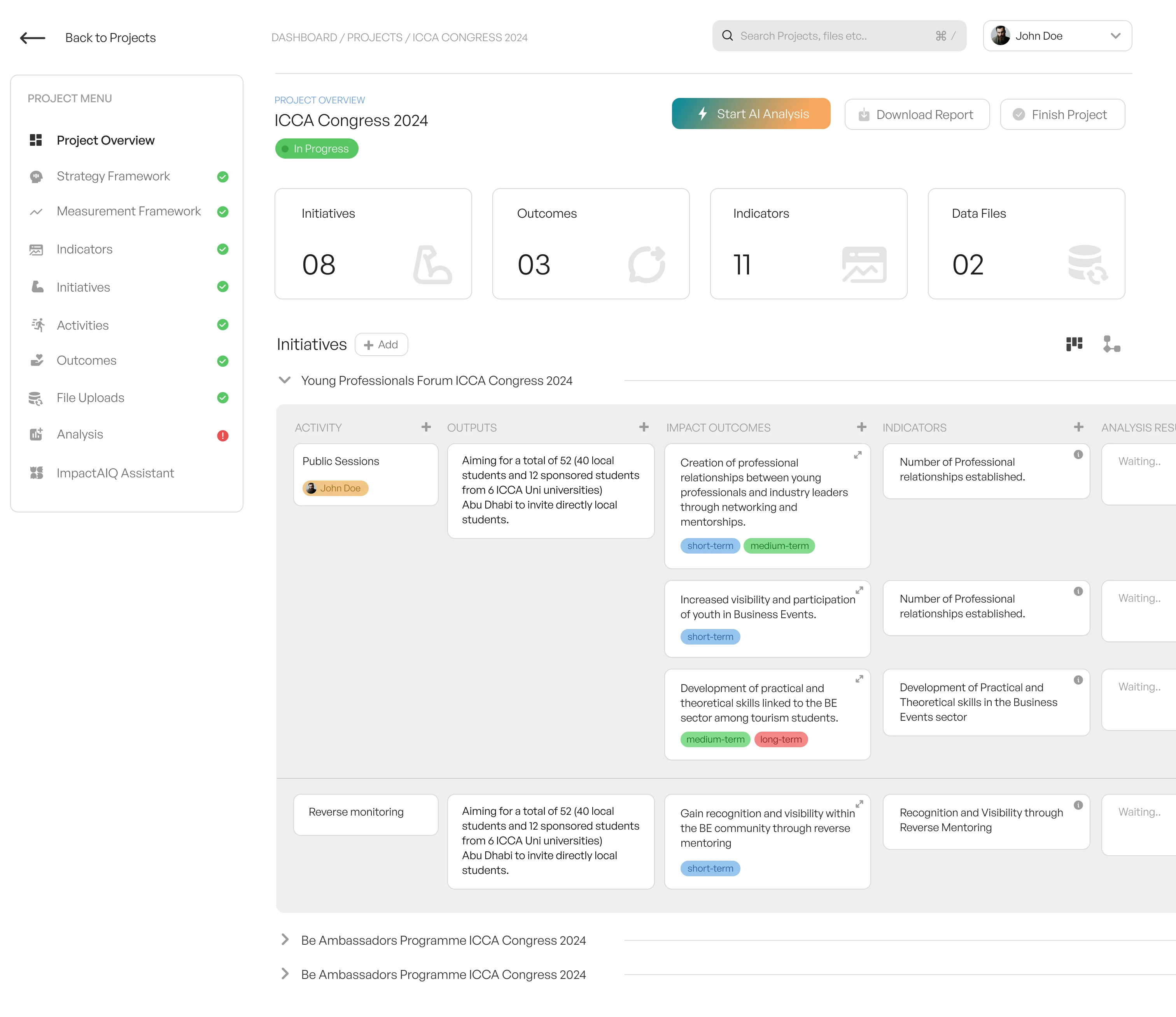
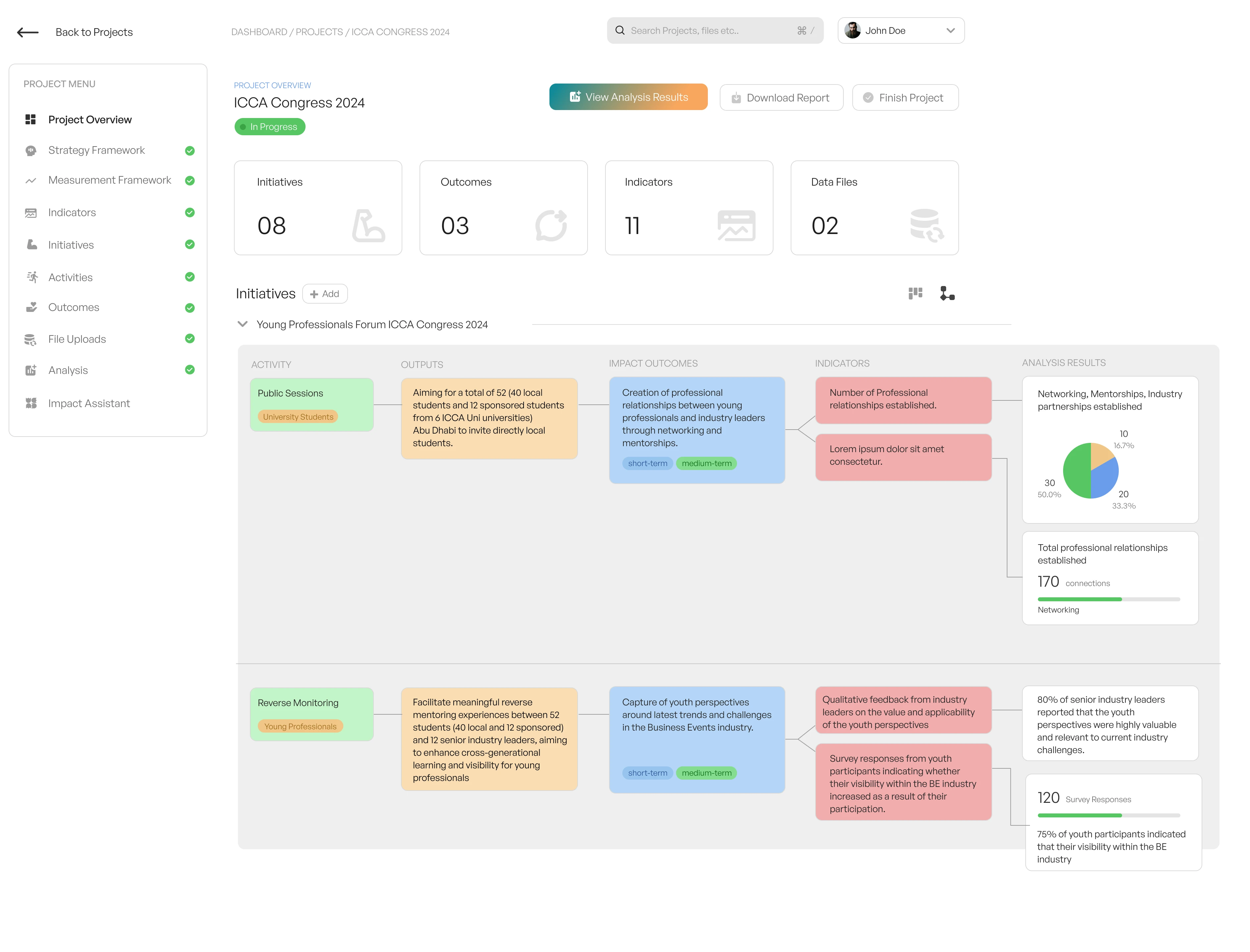
Zero-to-one design and development management for an AI impact analysis platform — PRD to shipped MVP in time for a global event launch.
Web and mobile product design for a Dubai-based decentralised finance platform — making blockchain accessible to non-technical users.
Full product design for a ChatGPT-powered custom chatbot builder — conversational UI, embeddable widgets, and brand identity.
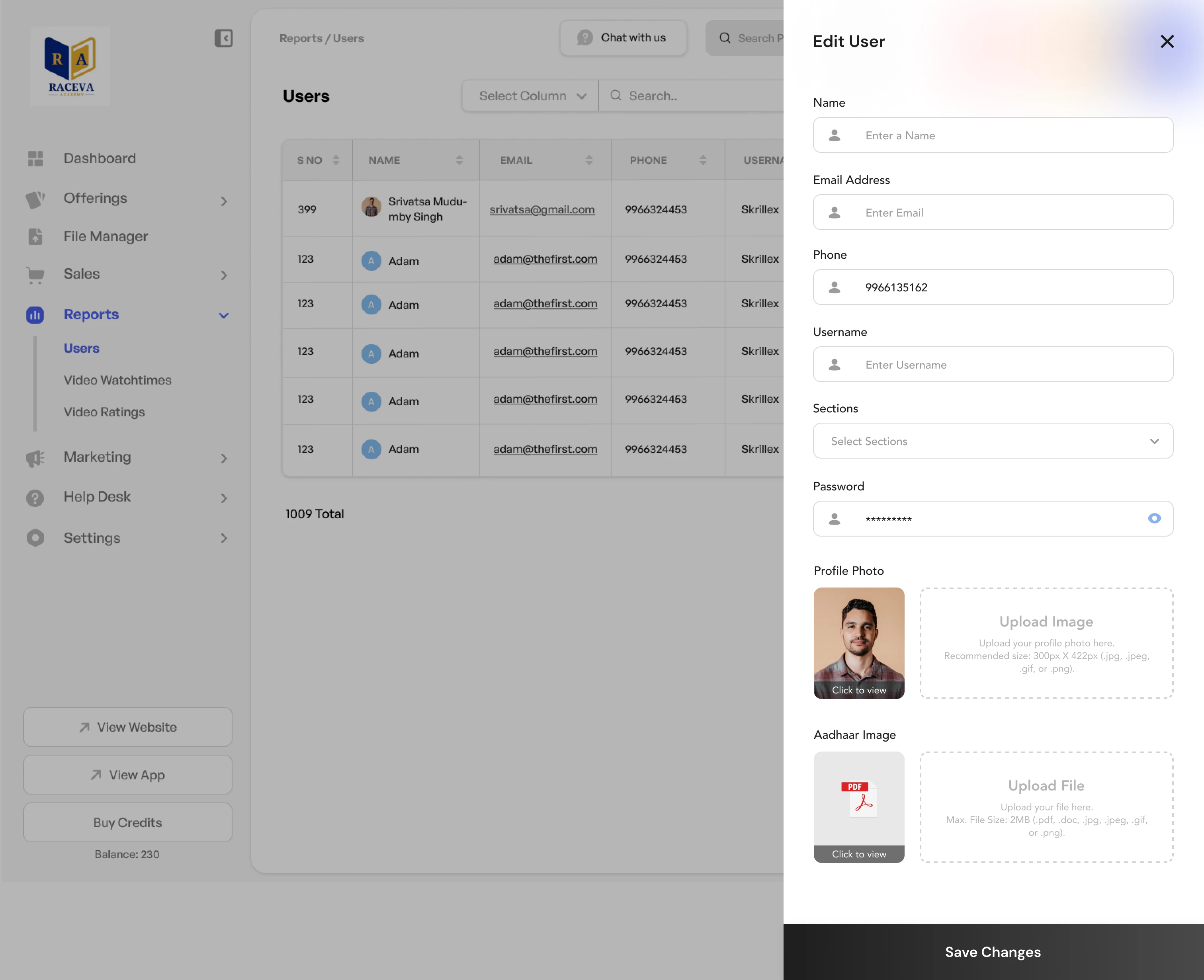
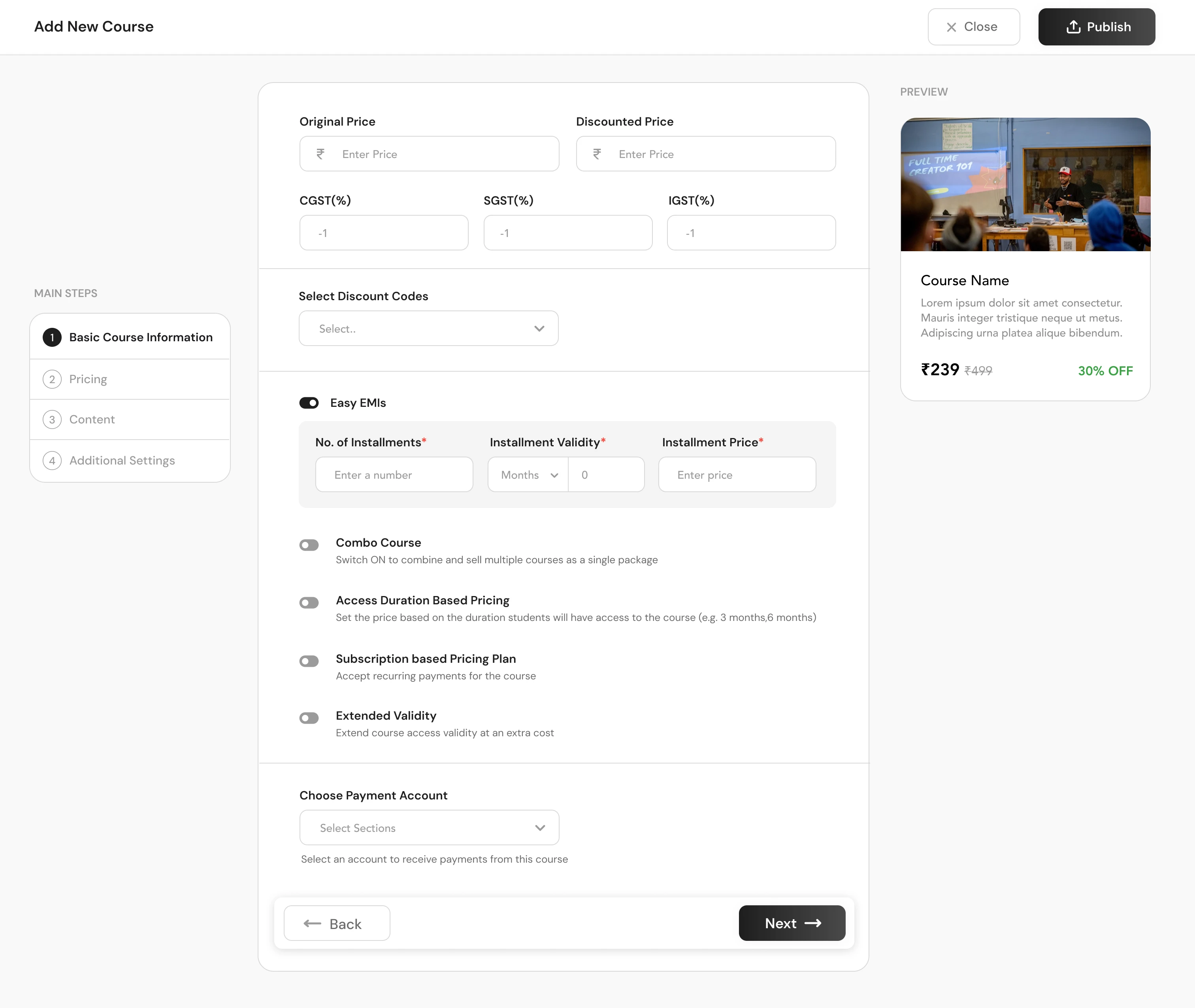
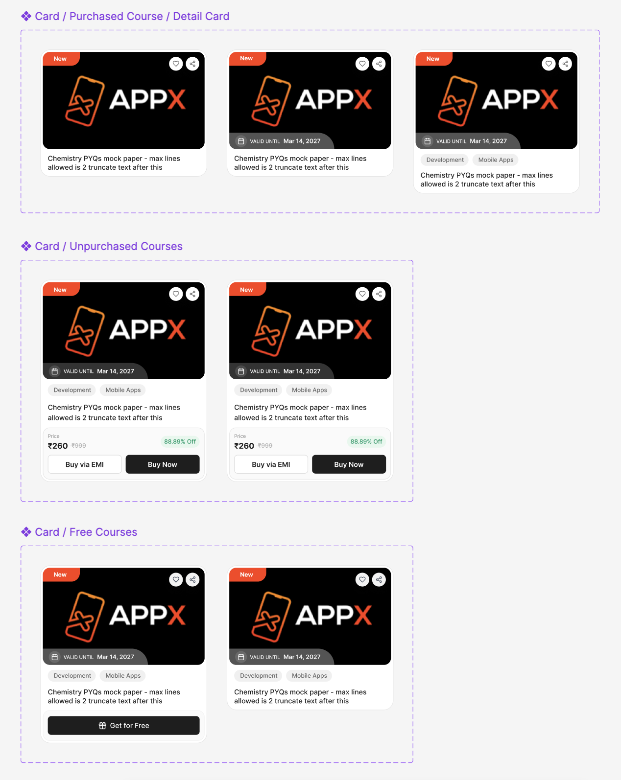
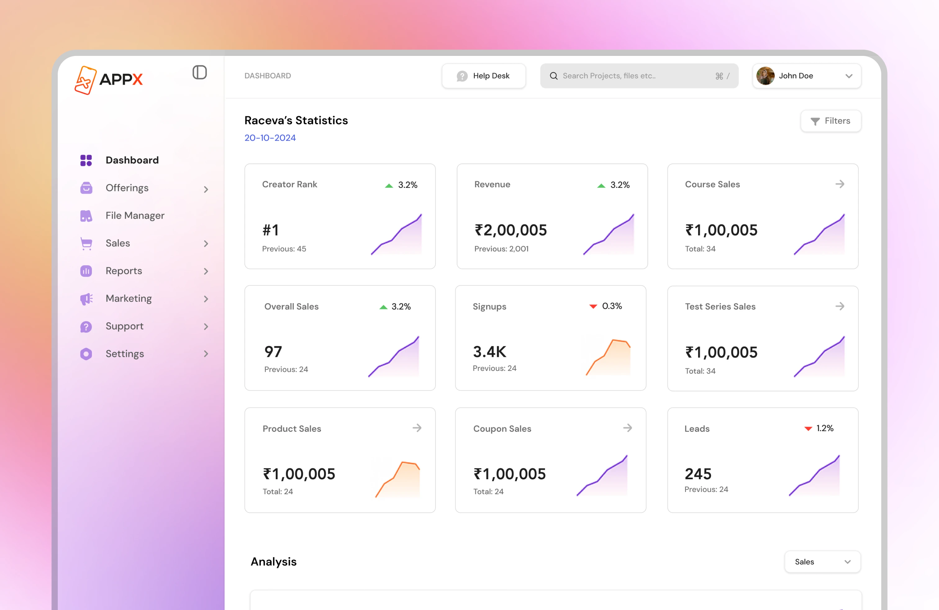
Redesigned the creator dashboard for AppX (Y Combinator S21), used by 1M+ users, with a clearer information architecture and rebuilt design system.
Built from zero as founder and head of design — grew to 5,000+ creators organically and was acquired by AppX (YC '21) in under 18 months.
Website overhaul for an AI-powered EventTech SaaS — new design system, UX copy, and conversion funnel optimisation.
A mindful iOS app blocker that replaces impulsive app opens with a Bhagavad Gītā verse, a short reflection, and an intentional choice.
AppX (Y Combinator S21) was struggling with declining engagement on a creator dashboard used by over a million users. Through deep discovery, workflow simplification, and a rebuilt design system, I drove a 43% engagement lift without adding a single new feature.
AppX is a Y Combinator-backed EdTech platform that lets educators and creators build online courses, membership sites, and digital products. After their Series A raise, the creator dashboard — the core product surface — was visibly straining under its own growth.
The product had been built fast. Features were layered without a coherent information architecture, navigation patterns were inconsistent across platforms, and creators were increasingly writing in to support to do things that should have taken two clicks.
I joined as the product designer responsible for the creator-facing product, working embedded in a cross-functional squad with two engineers, a PM, and growth analysts.
My mandate: diagnose the usability issues, design a new system from the ground up, and ship iteratively without disrupting the 1M+ users already in-product daily.
Conducted 12 moderated user interviews with creators across verticals (education, fitness, business coaching). Reviewed 3 months of Hotjar recordings to identify rage-click hotspots and drop-off patterns. Analysed support ticket themes with the CX team to create a quantified problem stack.
Card-sorted the full feature set with 20 existing creators to identify their mental models. Restructured the IA around three core jobs-to-be-done: Create, Manage, and Grow. Reduced primary navigation depth from 4 levels to 2.
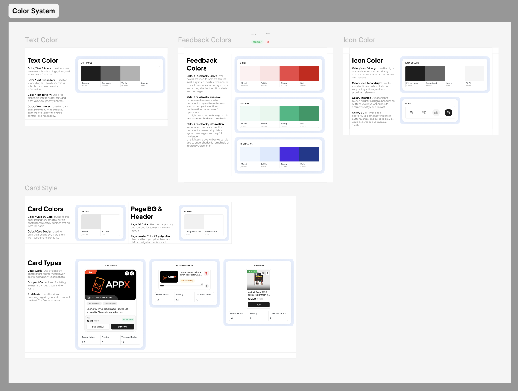
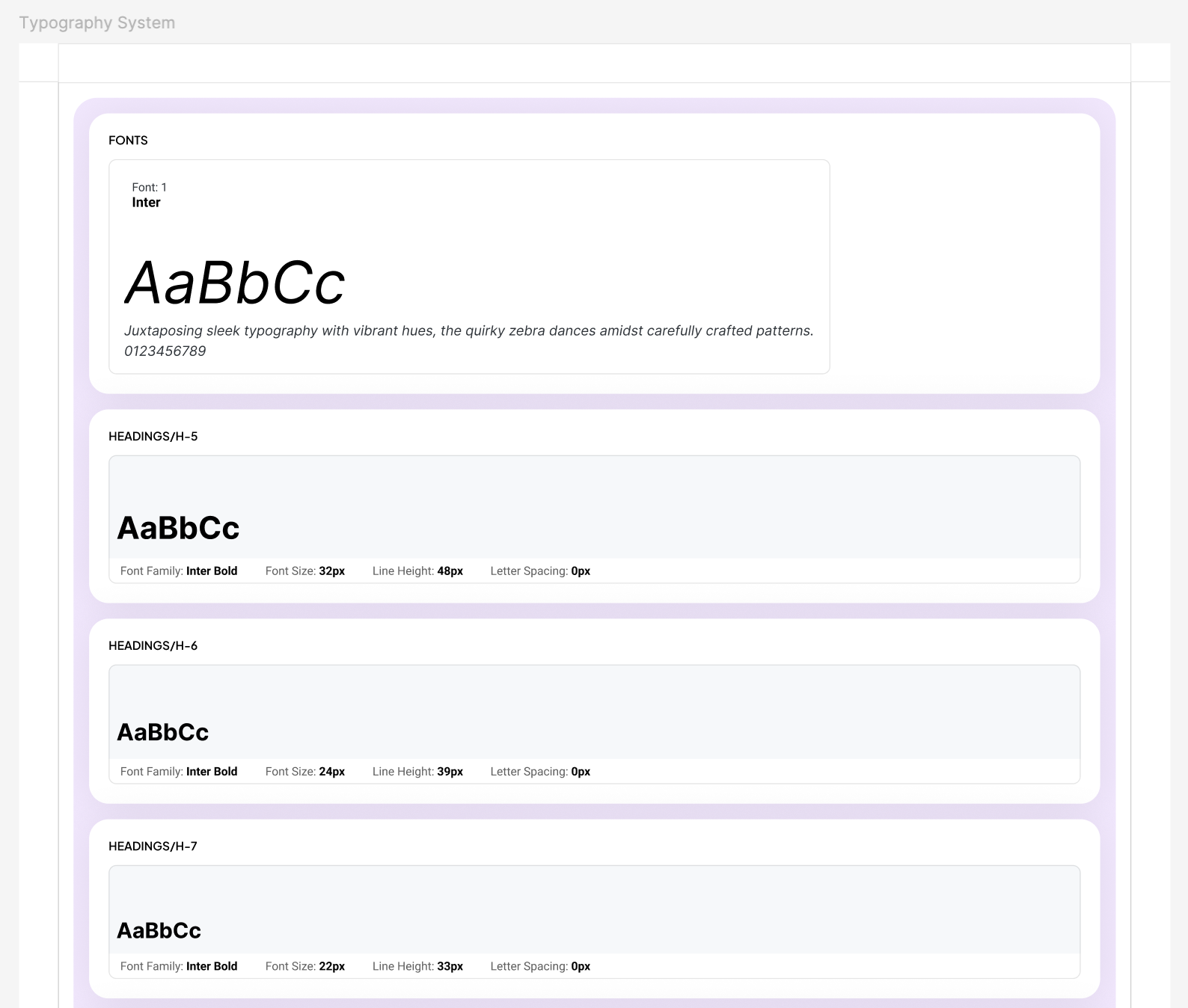
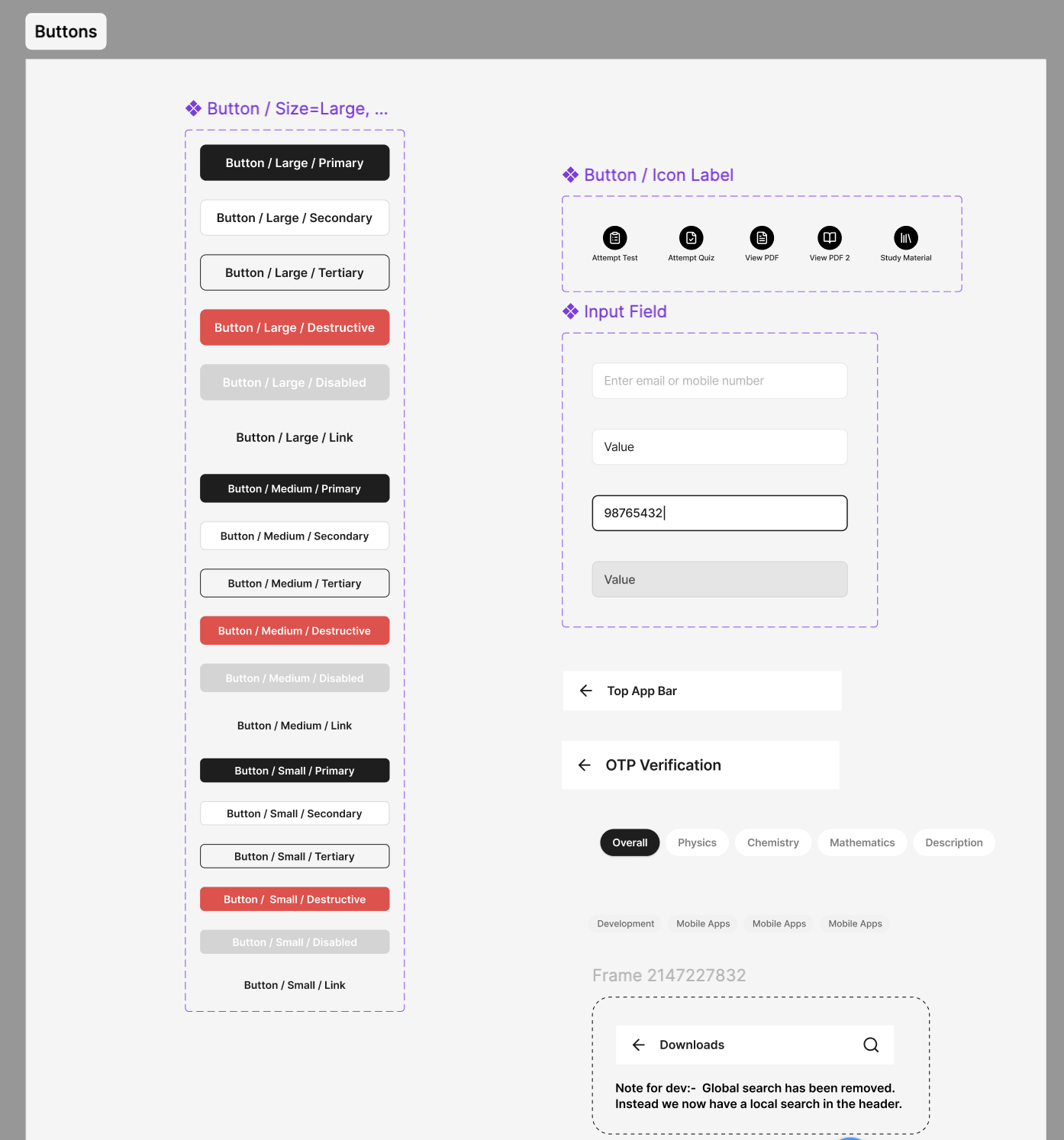
Built a component library from scratch in Figma — covering 60+ components with variants, states, and accessibility annotations. Established design tokens (colour, spacing, typography) mapped to CSS variables for dev handoff in Figma Dev Mode.
Built interactive high-fidelity prototypes for the 5 highest-impact flows. Ran two rounds of unmoderated usability tests (n=30 per round via Maze) and iterated on findings before dev handoff. Measured task completion rate from 58% to 91% on core flows.
Shipped in 6 two-week sprint cycles alongside two engineers. Used feature flags to roll out changes progressively, monitoring engagement and error rates per feature. Maintained a living design spec with inline Loom annotations for complex interactions.
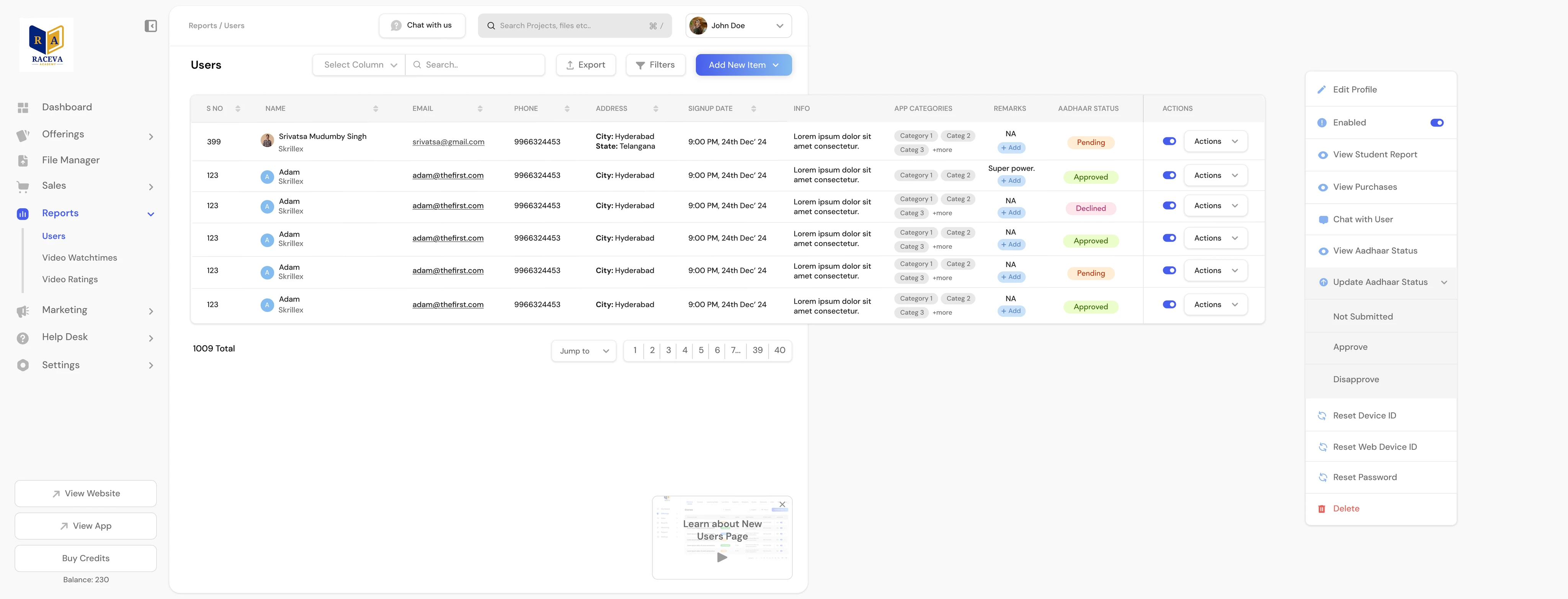
Measured over a 90-day post-launch window across the full creator base. Feature flags allowed us to A/B test the new dashboard flows against the legacy UI before full rollout.
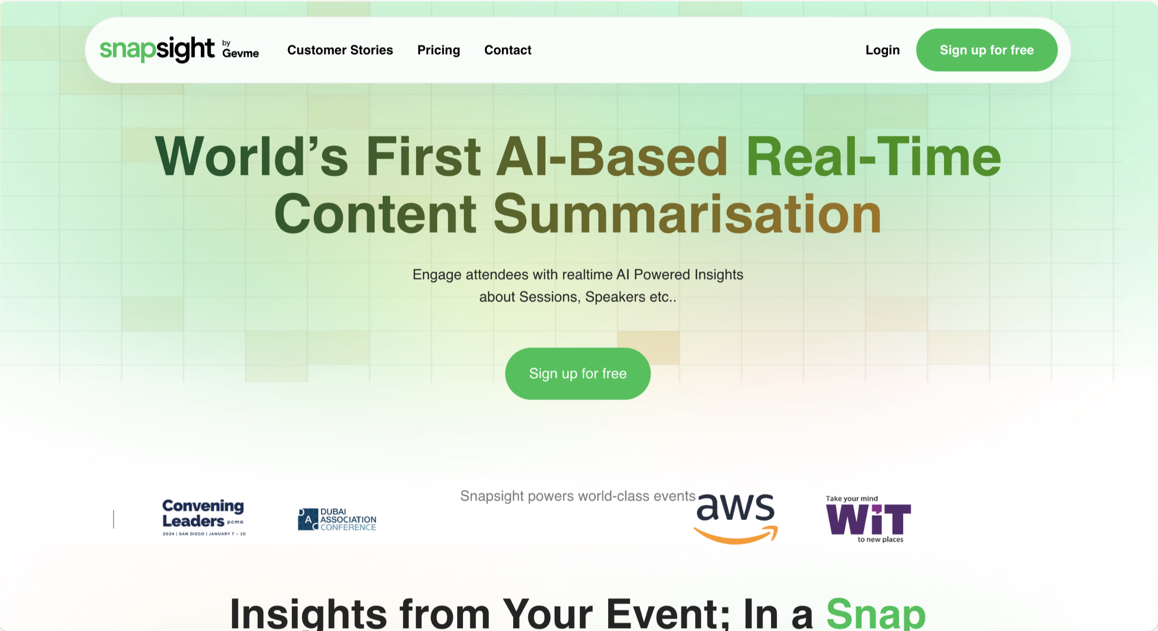
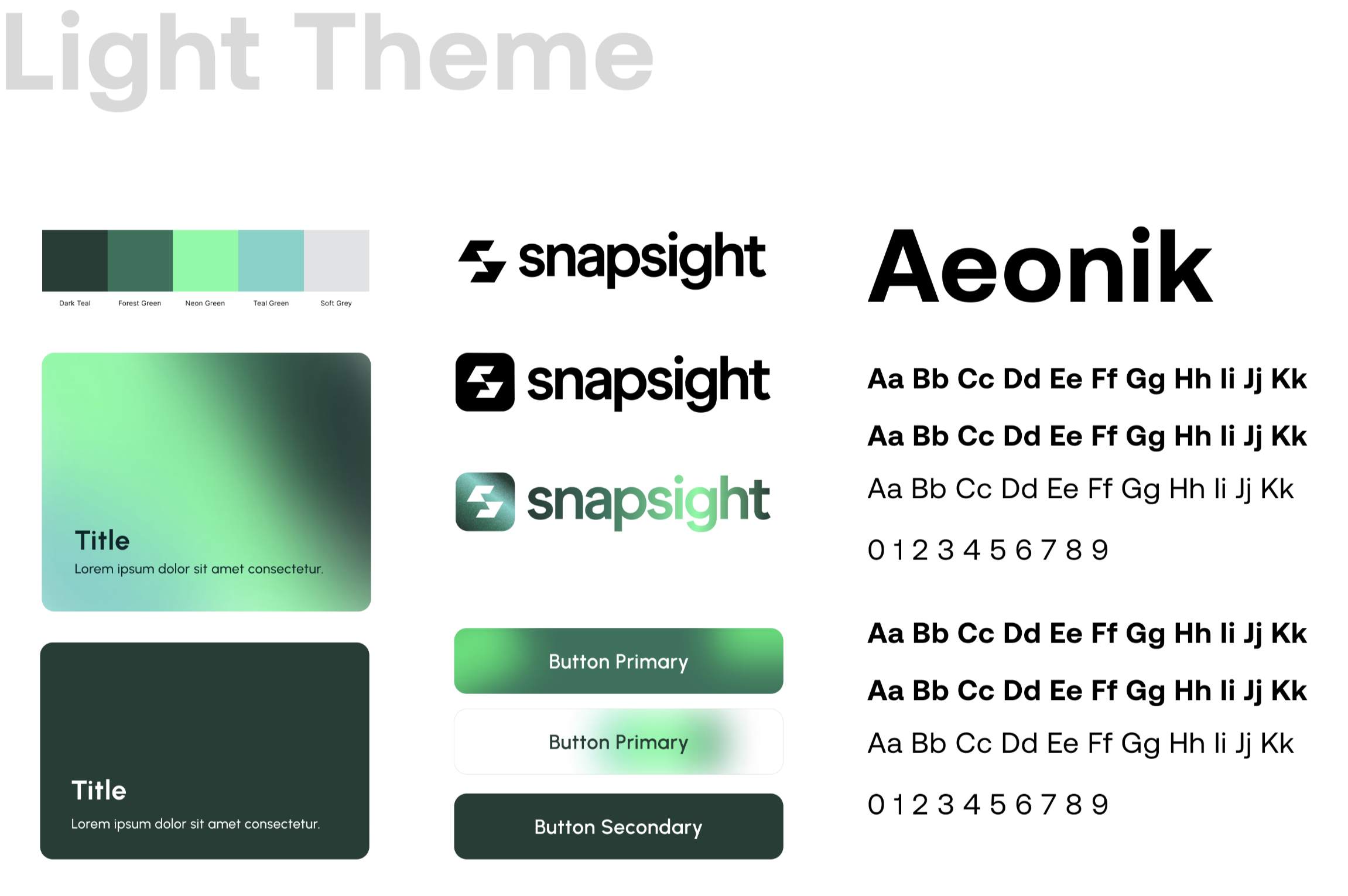
Snapsight was sitting on a breakthrough AI product but their website was still telling the old story. I led a full redesign — new visual identity, design system, and conversion-optimised UX copy — that helped them close a 125% annual sales increase.
Snapsight AI had evolved significantly — from a post-event survey tool to a full AI-powered event intelligence platform. But their website still read like the old product. Enterprise buyers visiting the site were confused about what Snapsight actually did, and the demo request flow had a drop-off problem the team had been tolerating for months.
The ask was end-to-end: new positioning, a visual refresh, a scalable design system, and handoff-ready specs. Eight weeks, shipped.
I led the project solo, collaborating with Snapsight's marketing lead on messaging and their dev team for implementation review and Framer build.
Success looked like: a website that instantly communicated the AI value proposition to an enterprise EventTech buyer, drove more demo requests, and could be maintained and extended without me.
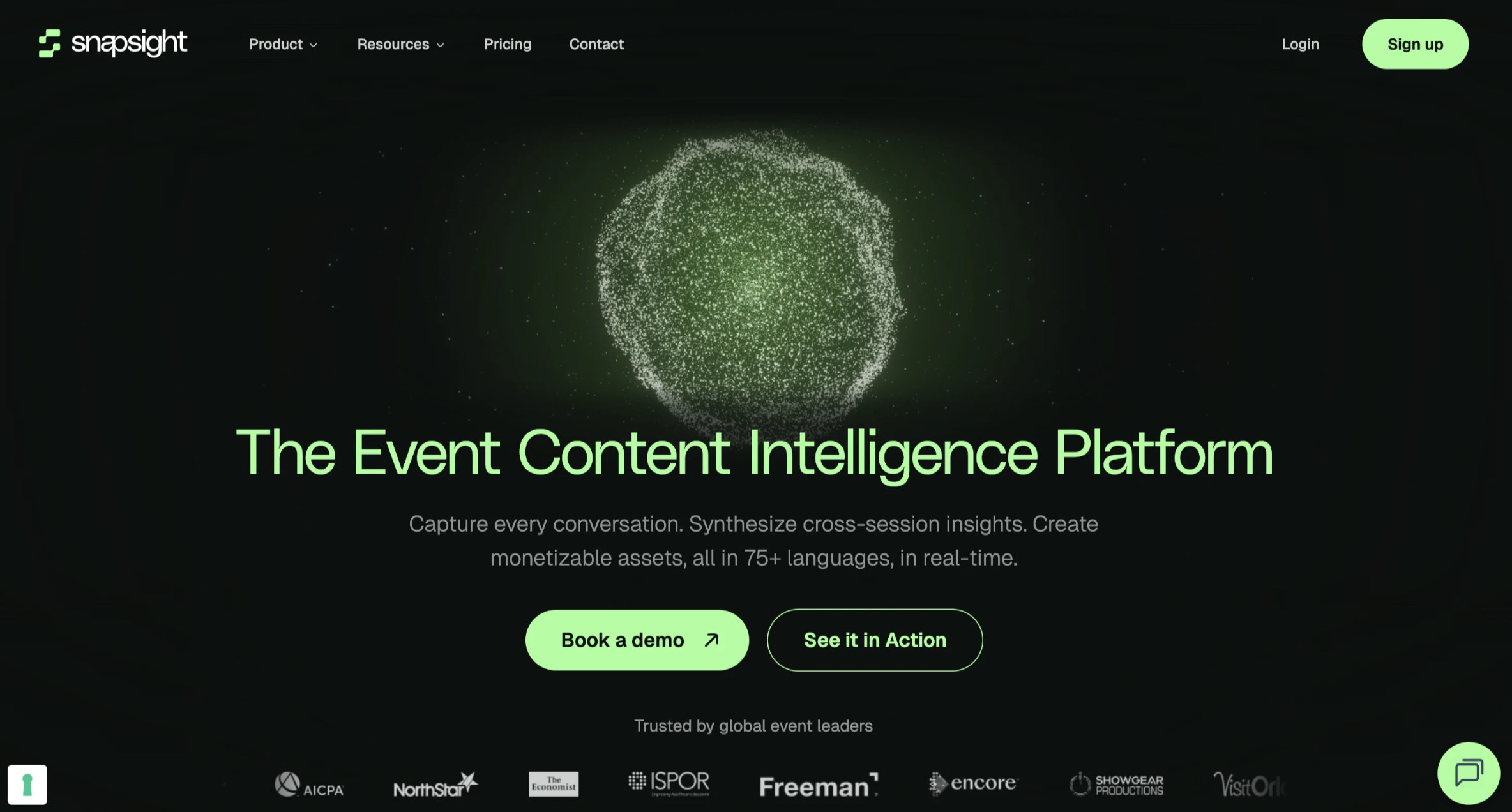
The original homepage opened with a generic tagline about "event insights." I restructured the hero to lead with the AI-specific outcome — what changes for the buyer after using Snapsight. The new headline tested significantly better in copy testing: clarity score up from 4.1 to 8.6/10 with target users.
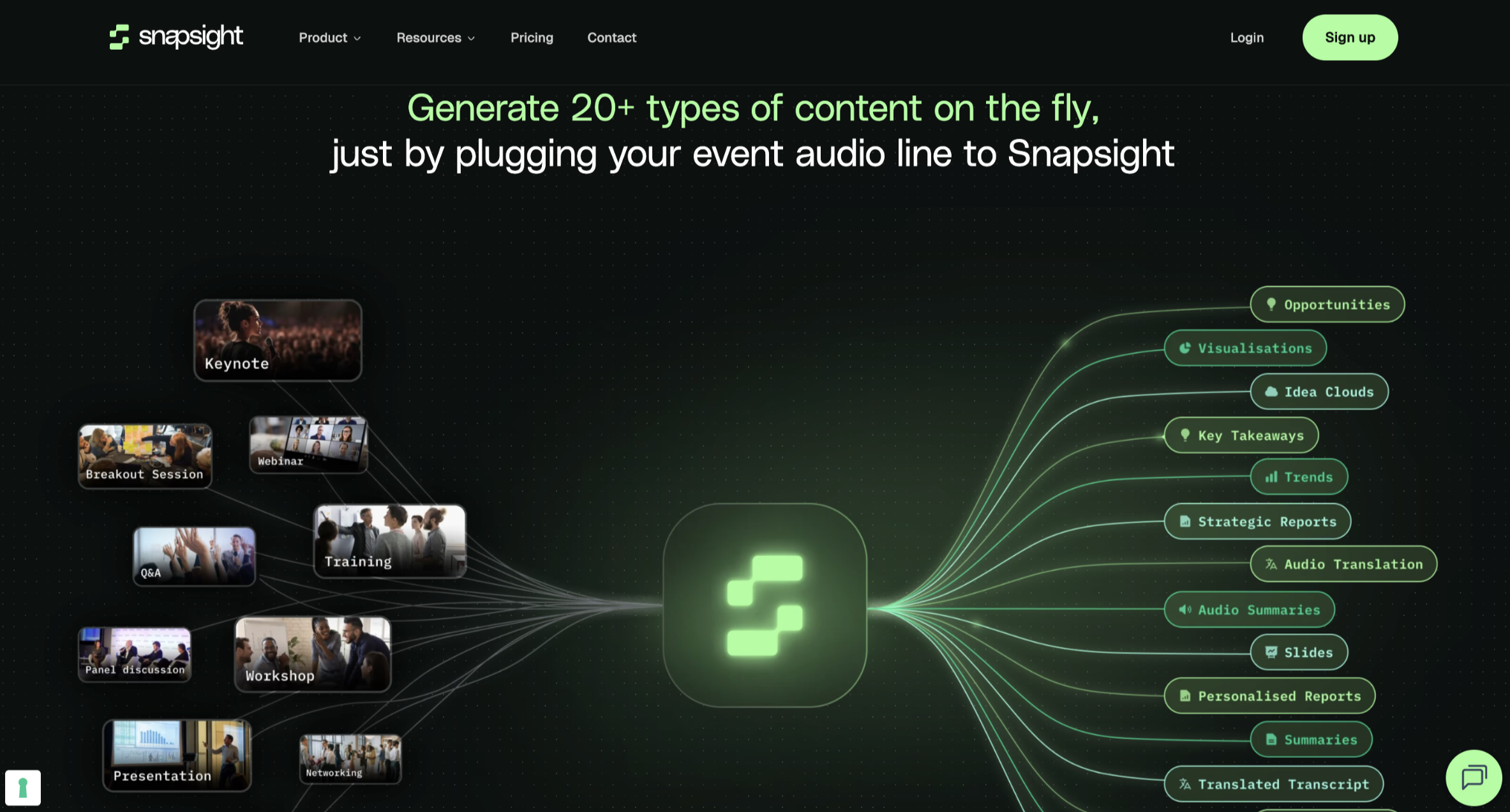
The original design used a dated blue-and-white palette with stock photography. I developed a new visual system: dark-mode primary with a signature accent, custom data visualisation components as decorative elements, and a motion language that implied intelligence without being gimmicky.
Rewrote all body copy, CTA labels, and feature descriptions to focus on buyer outcomes rather than product capabilities. Replaced "AI-powered sentiment engine" with "Know exactly how your audience felt — instantly." Every CTA now states the next concrete step, not an abstract invitation.
Built a Figma component library the marketing team could extend without breaking the visual system. Created a Framer CMS structure so blog posts, case studies, and feature pages could be added by non-designers — reducing design dependency for content updates.
Measured against 90-day pre-launch baseline. The redesign launched in April 2025.
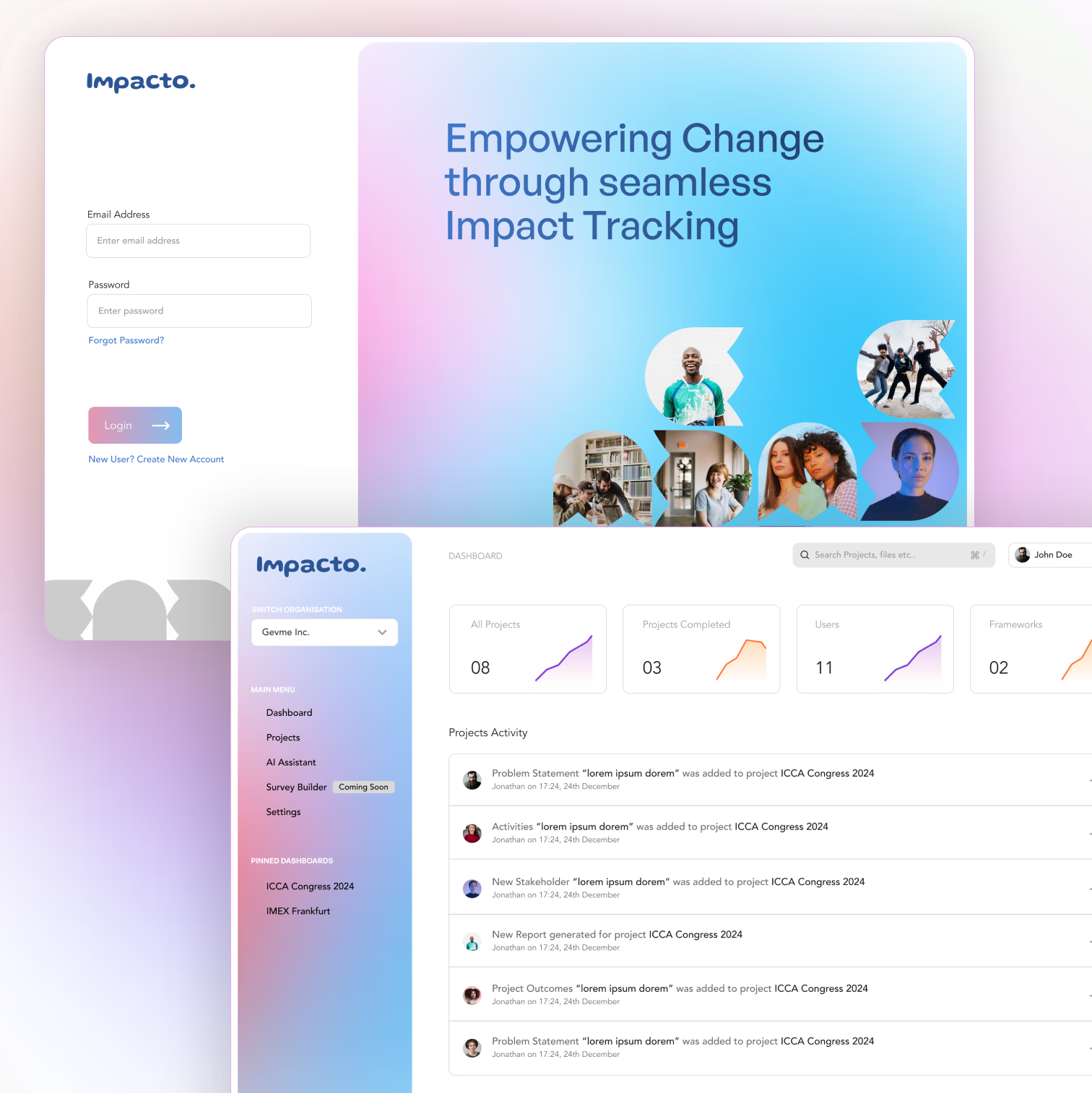
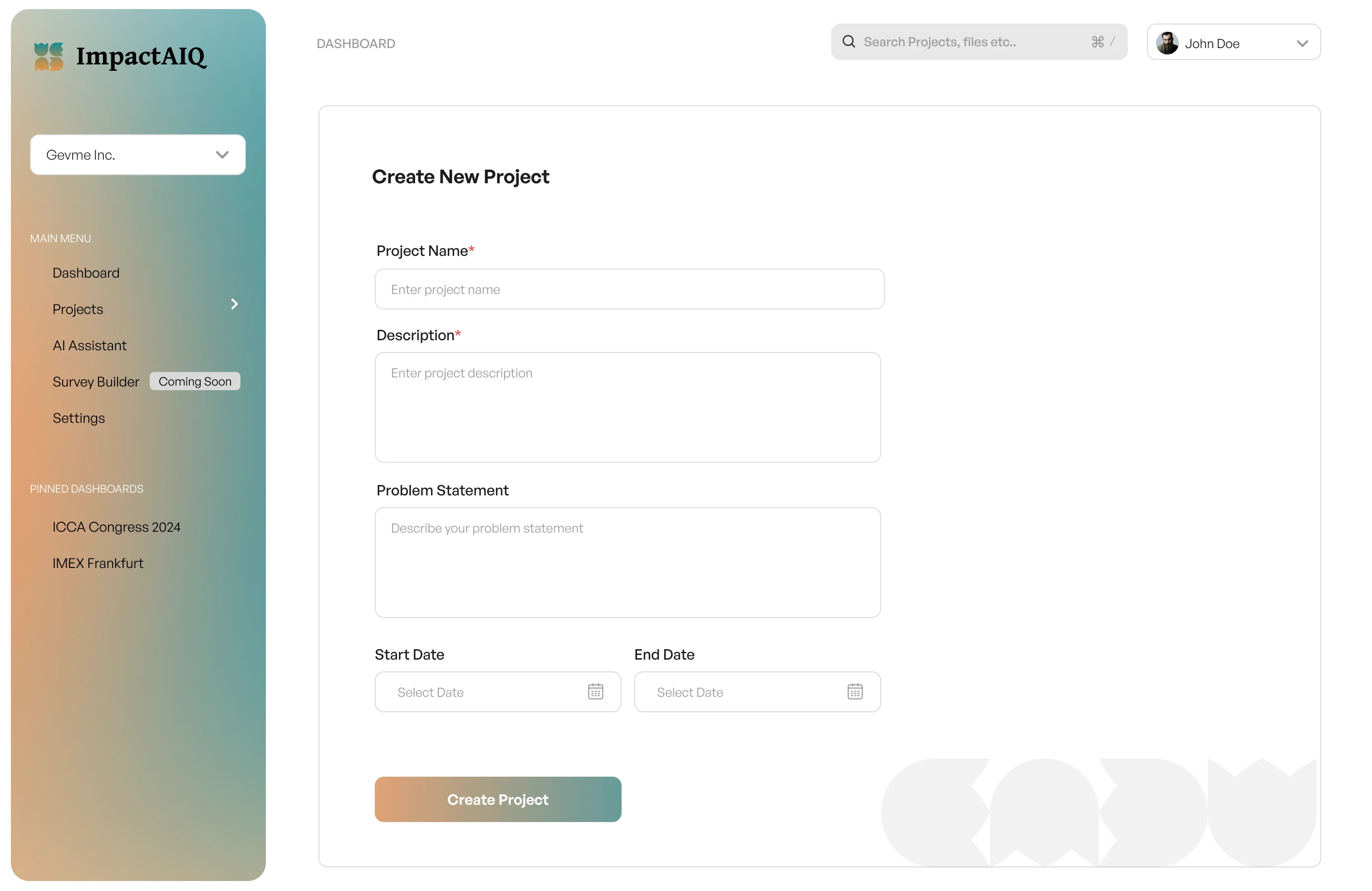
ImpactAIQ had a hard deadline — a global conference launch. I designed and managed development of the entire platform, from early PRDs to a fully functional, high-quality MVP shipped on time.
ImpactAIQ approached Design Lime with a tight brief: they had a compelling AI-powered platform concept for measuring organisational impact, a funding commitment, and a global conference slot booked for the launch — and no product yet.
The team needed a designer who could move from concept to shipped MVP without losing fidelity or velocity. That meant doing design and product management simultaneously.
I scoped the MVP, wrote the PRDs, designed the full product, and managed the development team through to a live, demo-ready product — delivered on the conference deadline.
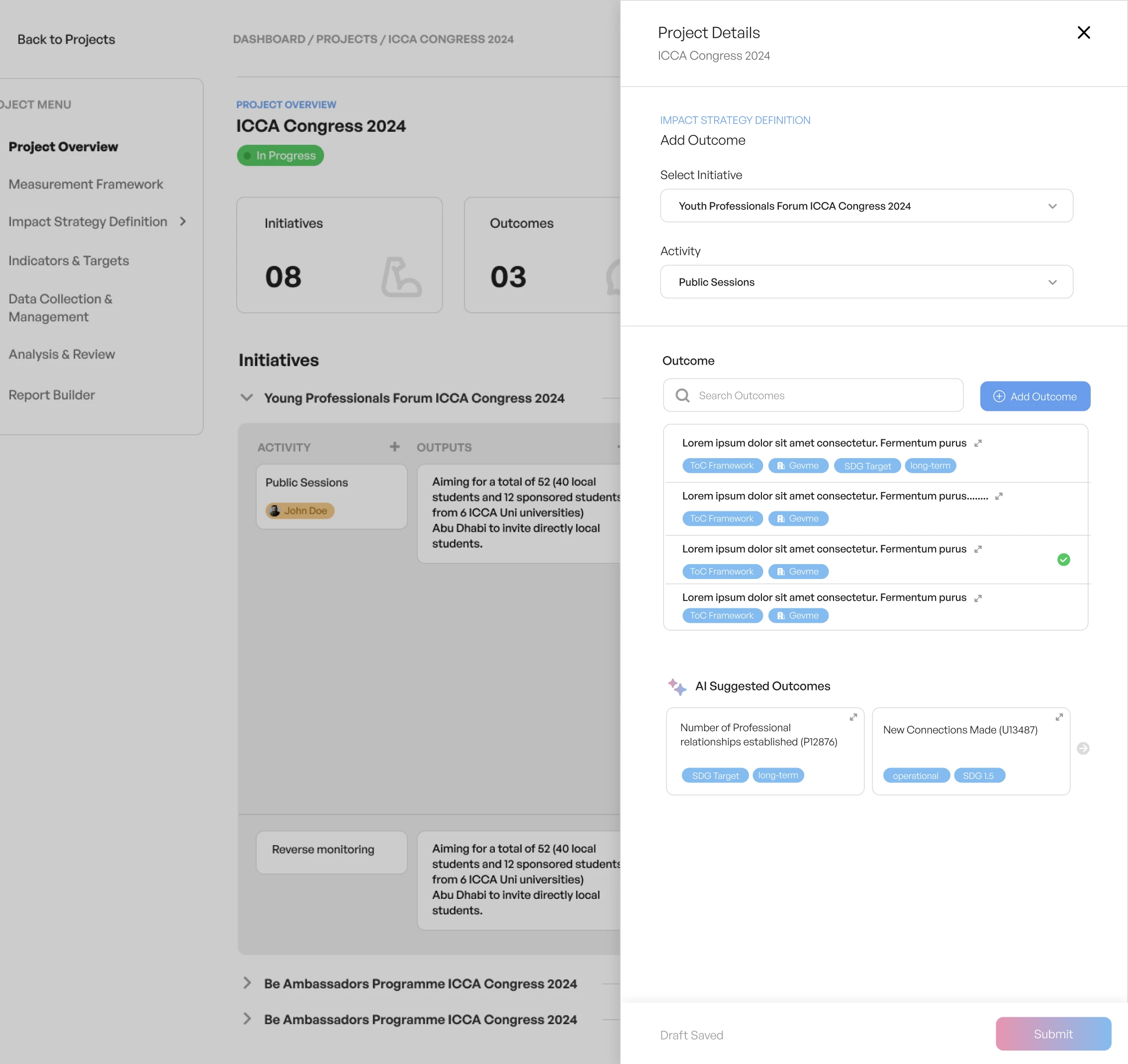
Core product surface: An AI-powered dashboard for organisations to quantify, visualise, and report their social impact — using data inputs from existing systems to generate insights automatically.
Co-authored product requirements documents with the founders, defining the MVP feature set by ruthlessly cutting anything that wasn't essential for conference validation. Mapped user flows for 3 core personas: Impact Officer, Executive Sponsor, and External Auditor.
Built the design system (tokens, components, patterns) before any screen design began. This allowed parallel workstreams — design could proceed on multiple screens simultaneously without creating inconsistency, and dev could start building components before full flows were designed.
Designed all screens at full fidelity — no wireframe phase given the time constraint. Used Figma's Dev Mode with inline annotations for every interactive state, edge case, and responsive breakpoint. Ran daily standups with the dev team to unblock implementation questions in real time.
Led QA reviews in the final two weeks, logging and prioritising visual bugs and interaction issues. Separated must-fix from nice-to-fix to protect the deadline while ensuring the demo flow was flawless.
ImpactAIQ launched on schedule at the global event, demoed live to investors and enterprise prospects, and received strong early validation for the product concept. The design system built during the MVP phase continued to be the foundation for post-launch feature development.
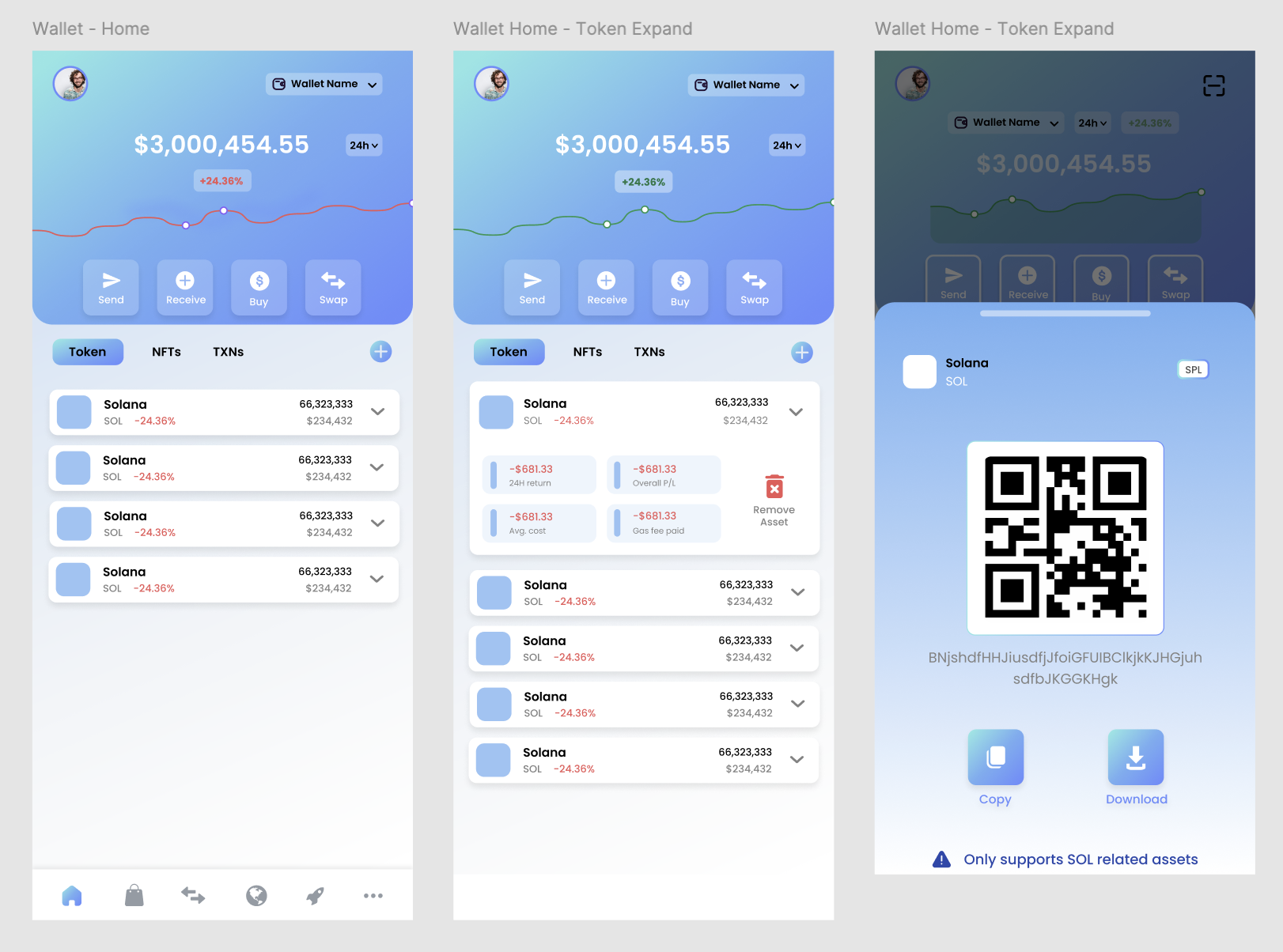
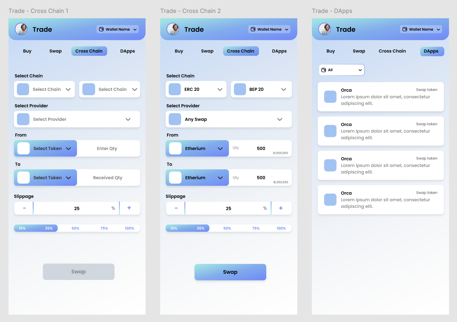
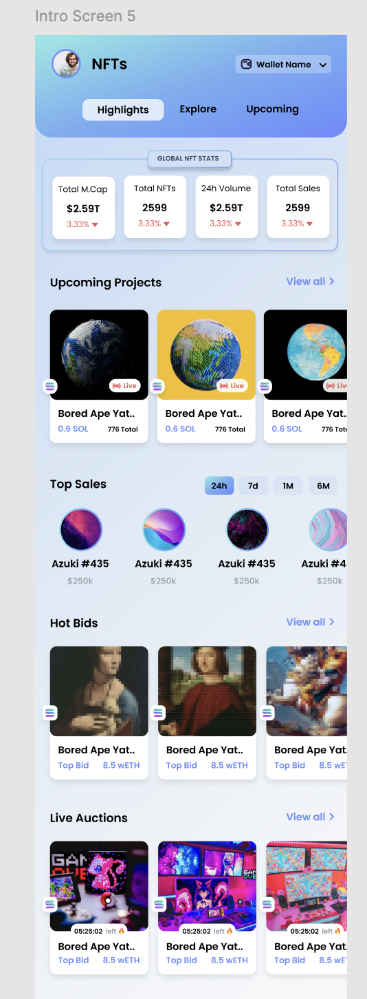
Designed a multi-chain FinTech wallet for a Dubai-based decentralised finance company — simplifying wallet creation, portfolio tracking, receiving assets, cross-chain trading, dApp access, and NFT discovery for users new to crypto.
Crypto wallets have a serious accessibility problem. Blockchain jargon, intimidating confirmation flows, irreversible transactions, and the fear of making a costly mistake keep the majority of potential users away from DeFi entirely.
This Dubai-based client was building a decentralised wallet targeting a dual audience: crypto-native power users who wanted full control, and first-time crypto holders who needed guidance.
The core design tension: advanced DeFi functionality (staking, liquidity pools, multi-chain swaps) needed to coexist with a consumer-grade onboarding experience that felt closer to Revolut than MetaMask.
I handled the full design lifecycle — user research, IA, wireframing, high-fidelity design, and interactive prototypes — across web and mobile.
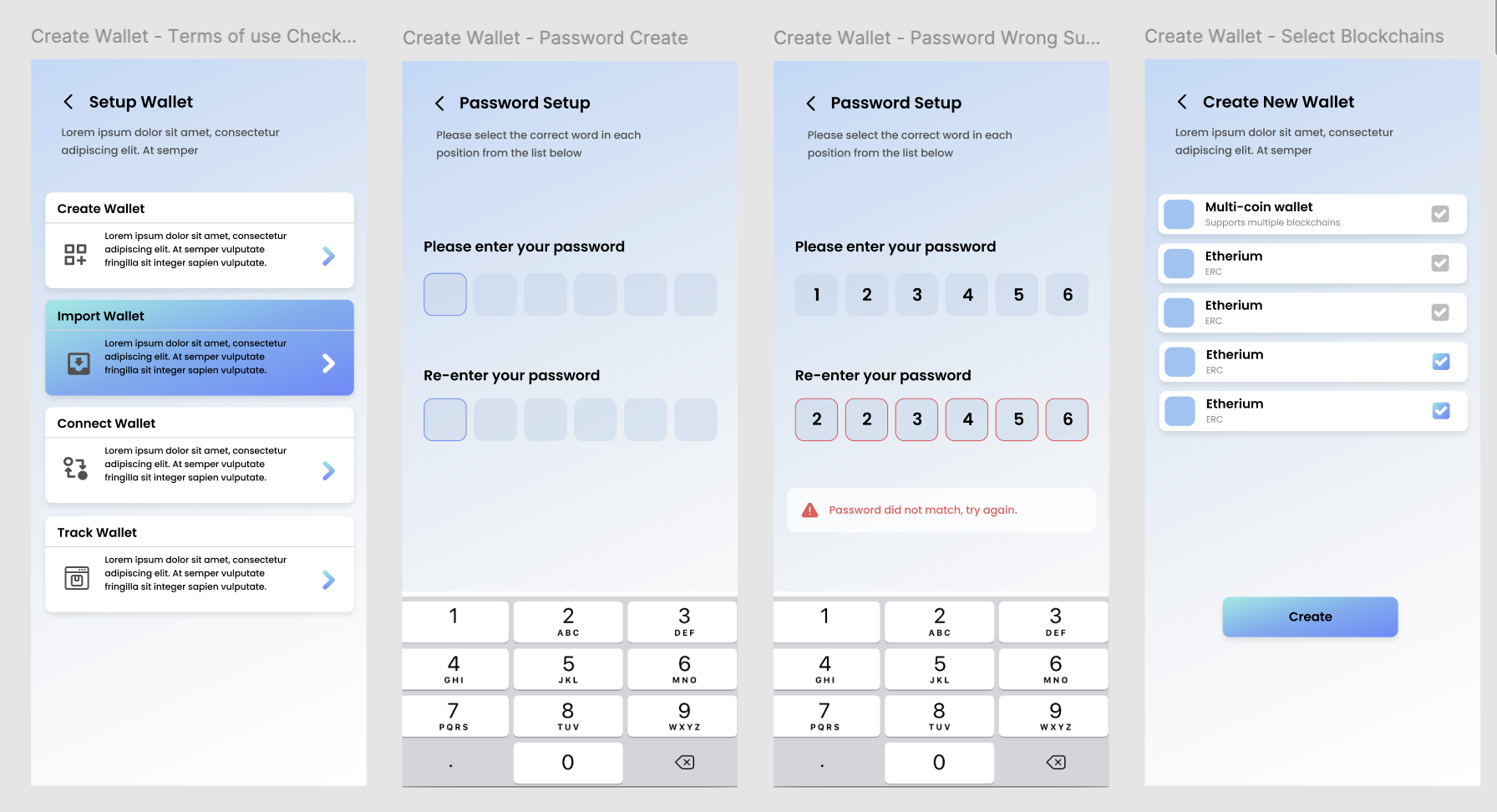
Separated create, import, connect, and watch-only journeys at the first decision point. A short PIN setup and explicit blockchain selection give users control without forcing them to understand the complete technical model upfront.
Designed a 3-step send flow with an address confirmation screen showing a visual checksum and ENS name resolution. Added an optional "test transaction" prompt for first-time sends. Clear fee display in fiat equivalent before, not after, confirmation — eliminating the surprise gas fee problem.
Combined buy, swap, cross-chain, and dApp discovery under one trade destination. Chain, provider, token, quantity, slippage, and estimated value follow a clear top-to-bottom sequence so users can understand what will happen before committing.
All interactive elements meet 44×44pt minimum touch target requirements. Bottom-sheet patterns for action confirmation keep critical actions in thumb reach. Bottom navigation optimised for one-handed use — the most common posture for mobile financial apps.
The product direction extended beyond storing and trading tokens. I designed an NFT destination that gives users a clear entry point into market activity—global statistics, upcoming projects, top sales, hot bids, and live auctions—without making the wallet home feel overloaded.
The same mobile design language carries across finance and discovery: compact cards, strong hierarchy, familiar filters, and contextual wallet controls.
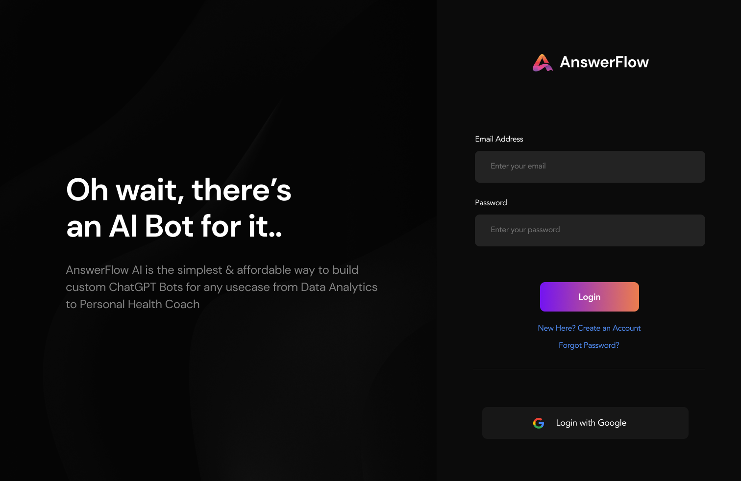
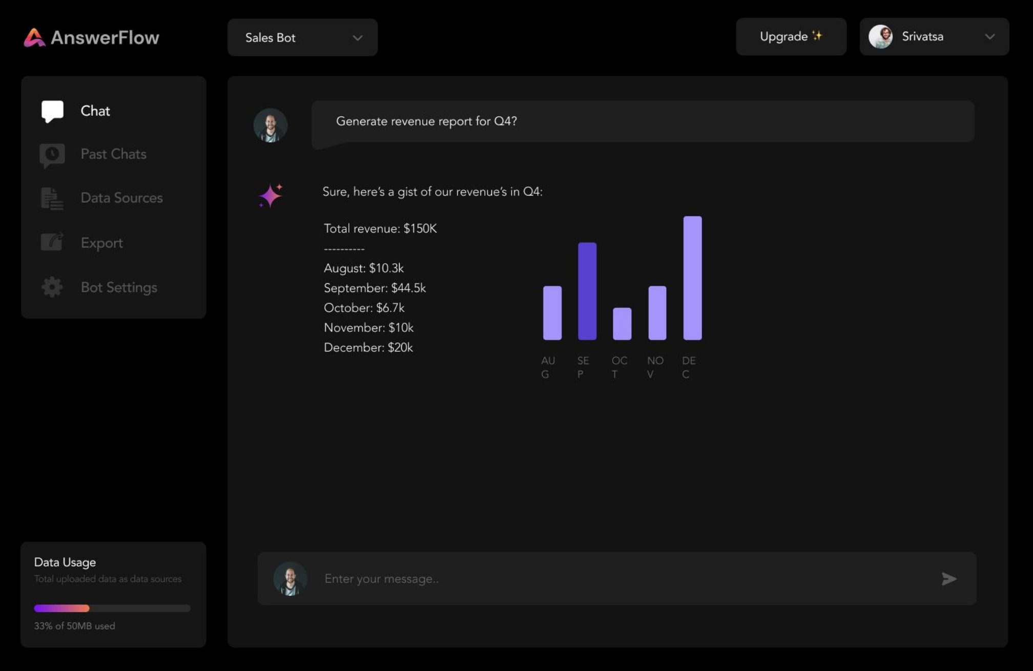
Full product design for a ChatGPT-powered custom chatbot builder — designing the builder interface, embeddable widget system, and brand identity for a B2B SaaS targeting non-technical business owners.
Answerflow AI lets business owners build custom AI chatbots trained on their own content — FAQs, product docs, support articles — without writing a single line of code. The core promise is powerful, but the challenge is the target user: a business owner who has never built software, doesn't understand embeddings or fine-tuning, and just needs "a chatbot that answers my customers' questions."
The product had three distinct design surfaces requiring cohesive but contextually distinct treatment: a builder dashboard (for creating and training chatbots), a customisation interface (for branding the widget), and the embeddable widget itself (what end-users of the chatbot see).
On top of this, I built the brand identity from zero — Answerflow had no visual direction when we started.
Developed a brand identity that communicated AI capability without feeling intimidating. Logo, colour system, typography, and iconography all built around a "knowledgeable but friendly" positioning — distinguishing Answerflow from the stark, technical aesthetic common in AI tooling.
Replaced a configuration panel metaphor with a step-by-step wizard that guided users through chatbot creation as a narrative: "Give your chatbot a name → Add your content sources → Test it → Deploy." Progress state was always visible. Users never saw a blank canvas.
Designed a live-preview customisation interface — users could change colours, fonts, avatar, and greeting text and see the widget update in real time on the right side of the screen. No guesswork, no "save and check" loop.
Designed the chat widget UI to be visually neutral by default and fully customisable through the dashboard. The widget needed to feel at home on a luxury spa website and a B2B SaaS platform simultaneously — achieved through a themeable token system rather than opinionated defaults.
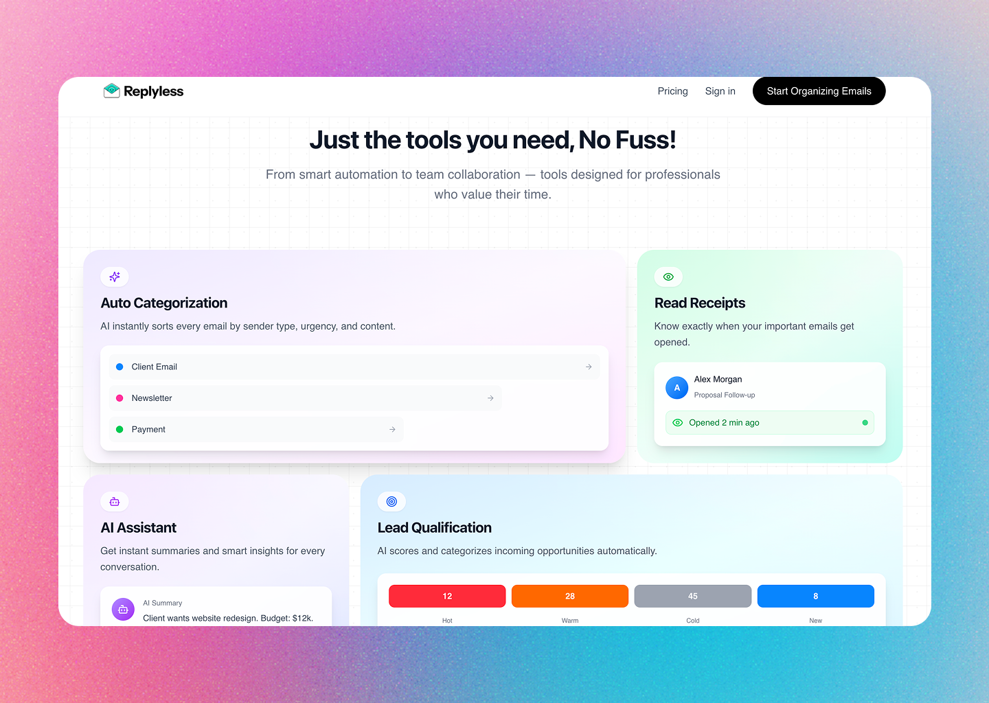
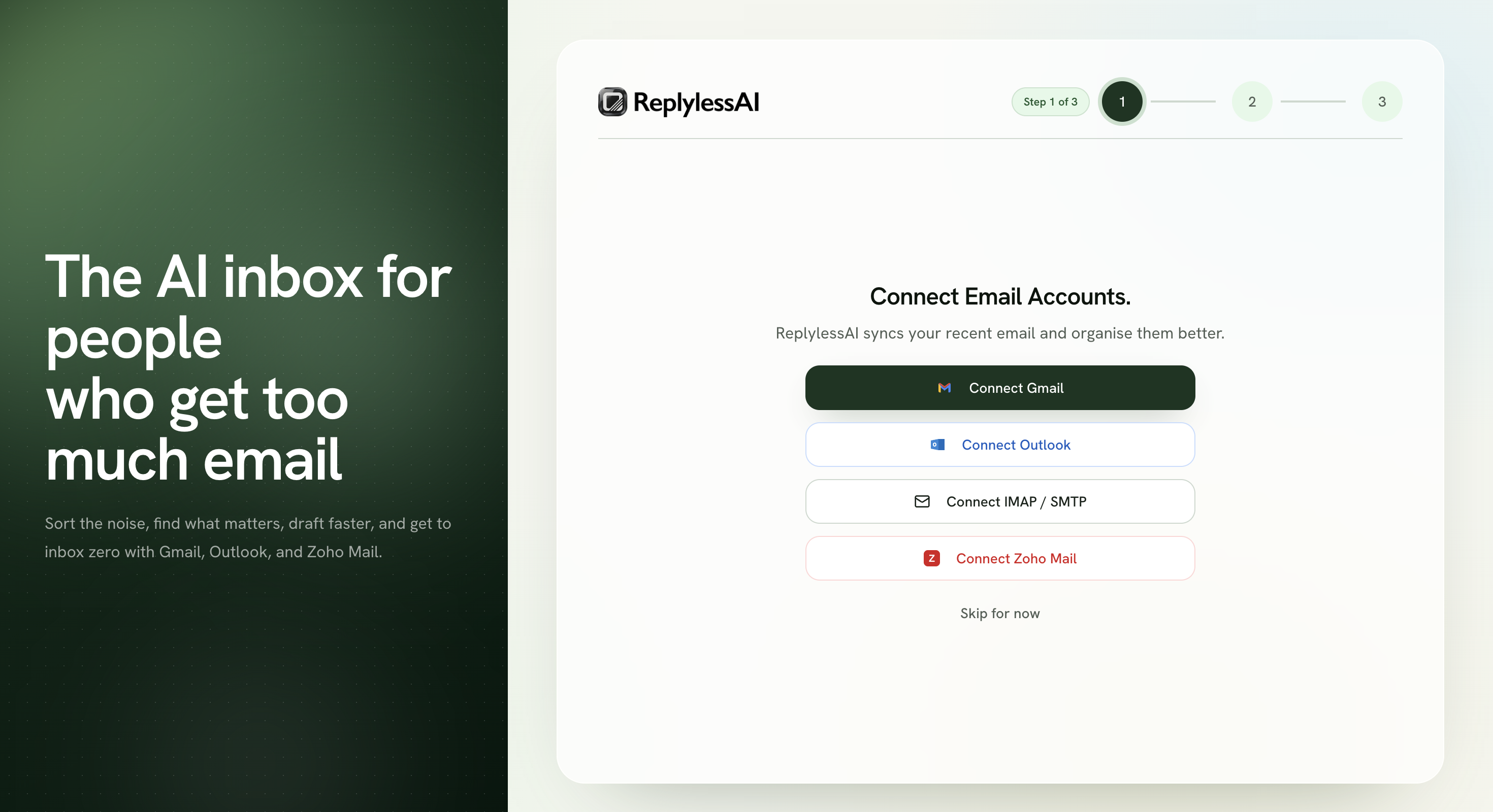
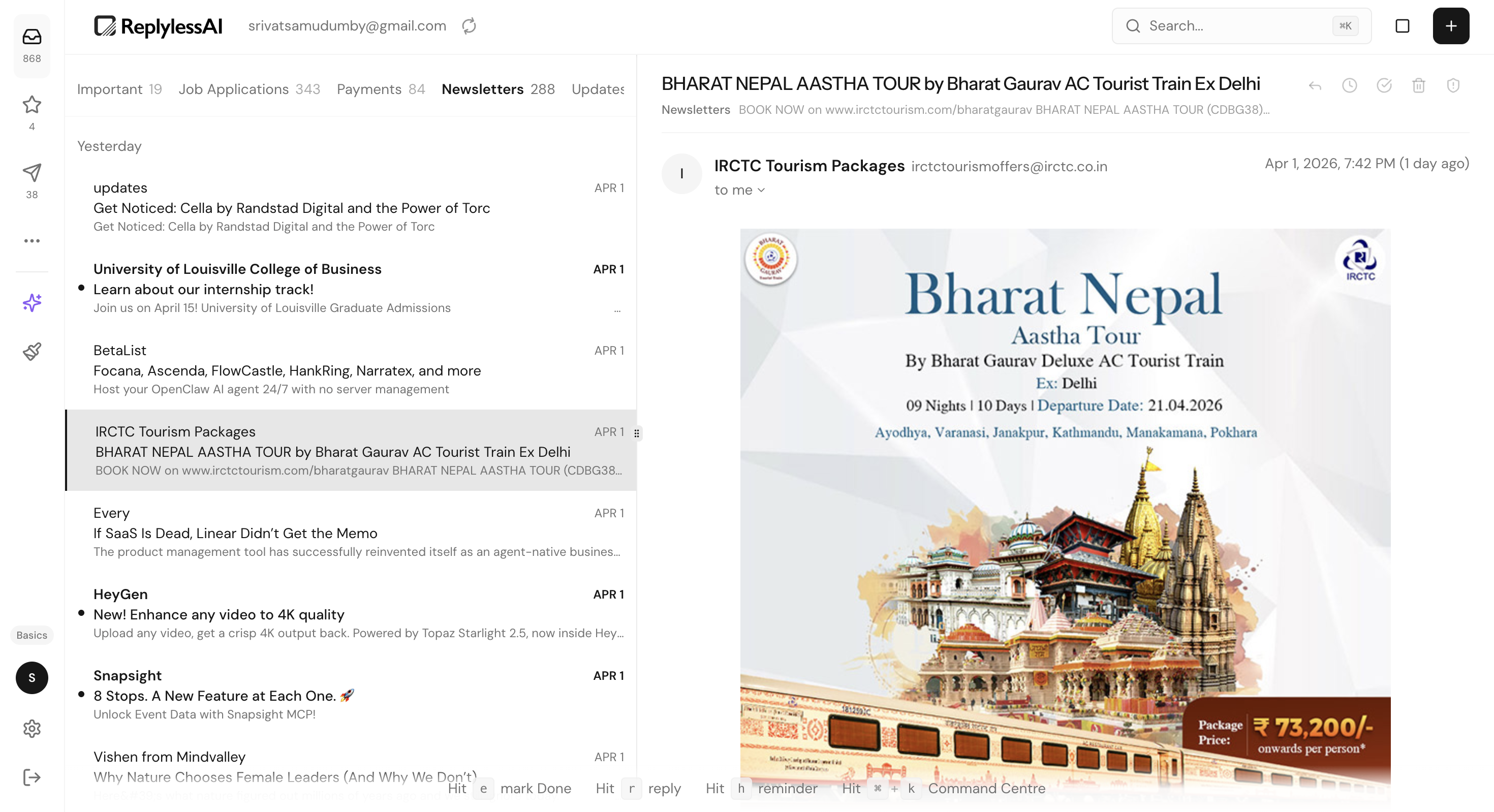
ReplylessAI is an AI-native email client I conceived, designed, and vibe-coded during the Antler MENA cohort. I used a fully AI-first workflow—from product framing and interaction design through functional implementation and deployment—to make email feel organised, actionable, and calm. Explore the live product at replyless.ai ↗
Email still runs a huge part of professional work, but the core interface hasn’t really changed. Important client threads, payments, newsletters, and updates all arrive in the same place and demand the same visual attention.
ReplylessAI was designed around a simpler product promise: automatically separate what matters, shorten the path to action, and let AI help without turning the inbox into a black box.
I approached it as a workflow product, not just a prettier mail client. The design had to help users scan faster, trust the system’s categorisation, and take action with less cognitive overhead.
Within the Antler MENA cohort, I carried that thesis beyond a prototype. I translated product strategy, interaction design, and system behaviour into a working platform through a fully AI-first, design-to-code workflow.
Core audience: founders, freelancers, and operators managing high volumes of mixed-priority email every day.
I used the Antler MENA cohort environment to sharpen the audience, workflow problem, product promise, and MVP scope before committing to interface directions.
I defined the information architecture, intent-based inbox model, interaction patterns, visual language, and reusable components as one coherent product system.
Using AI coding agents, I converted design intent into a functional React application, directing implementation through structured prompts, product specifications, acceptance criteria, and continuous visual QA.
I reviewed generated implementation against the intended user flows, corrected interaction and hierarchy gaps, refined the experience across breakpoints, and deployed the product and marketing surfaces.
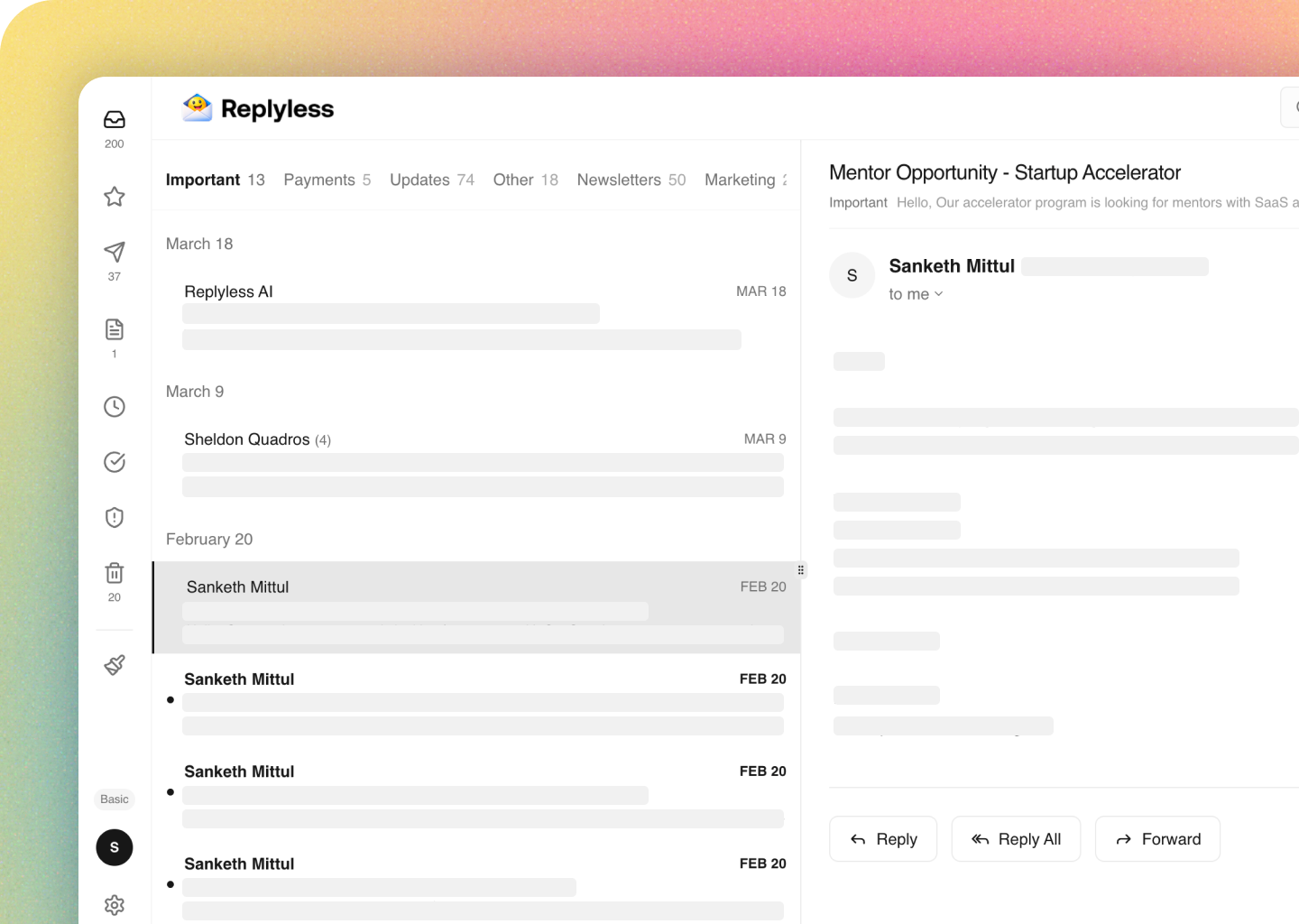
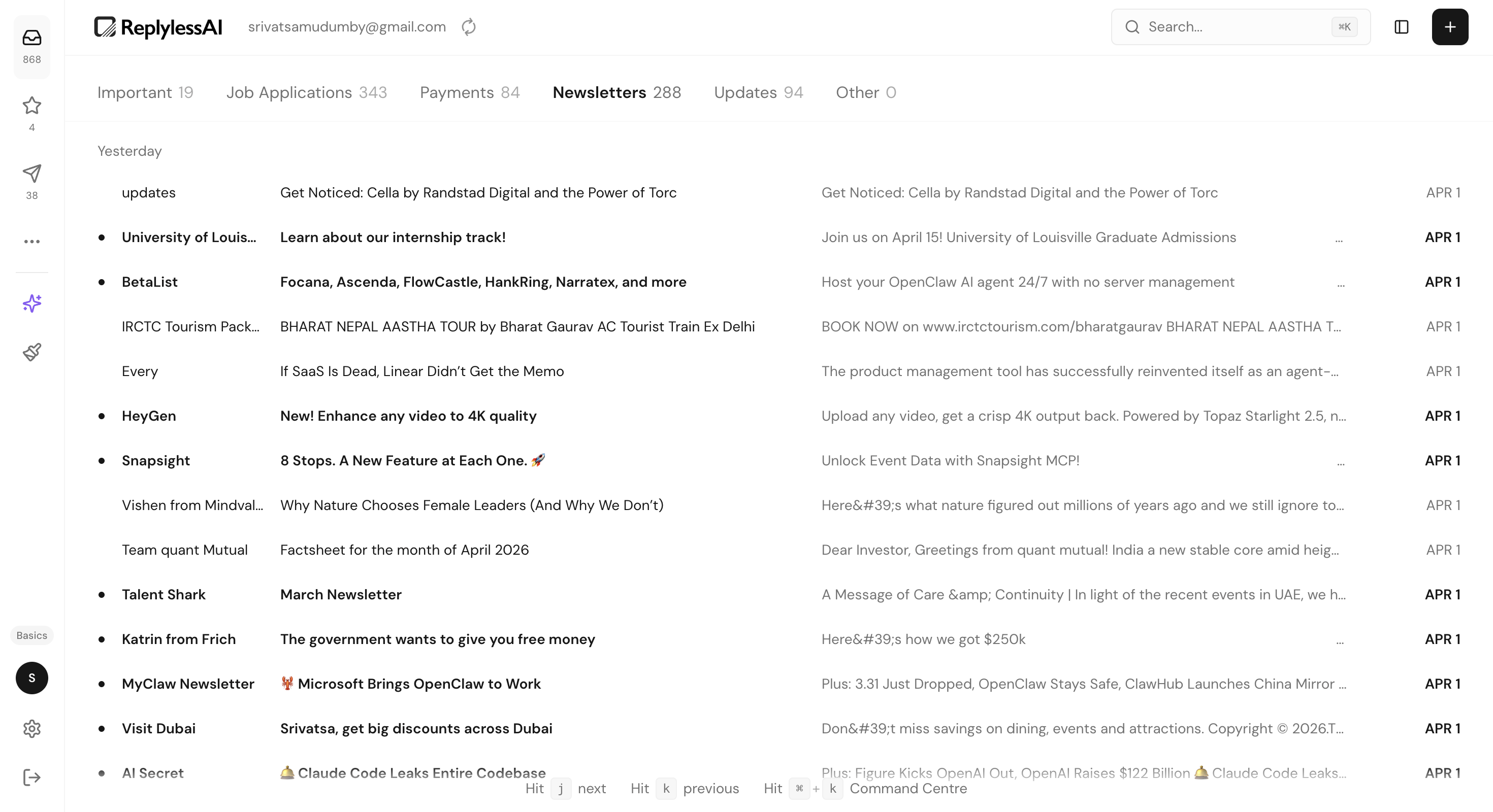
Instead of forcing users into a traditional unread/starred/archive workflow, I designed the inbox around real-world mental buckets: Important, Job Applications, Payments, Newsletters, Updates, and Other. This gives structure immediately and reduces the "where do I even start?" problem.
Quick actions like remind, complete, and delete live where the user is already looking. The goal was to remove toolbar hunting and make triage feel lightweight enough to do continuously instead of in long cleanup sessions.
The AI assistant was designed as an on-demand layer over the inbox, not a takeover. Users can search messages, find tasks, draft replies, and summarise threads inside a familiar chat surface while still keeping the original email context visible.
The visual direction uses soft gradients, light surfaces, and simple iconography to make a productivity tool feel approachable. The website and product were designed to tell the same story: this is serious software, but it should still feel easy to start using.
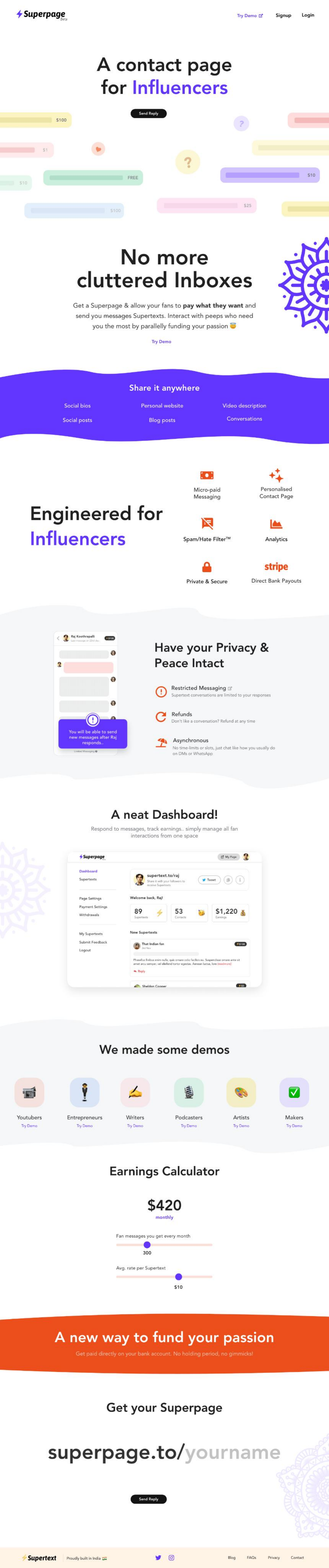
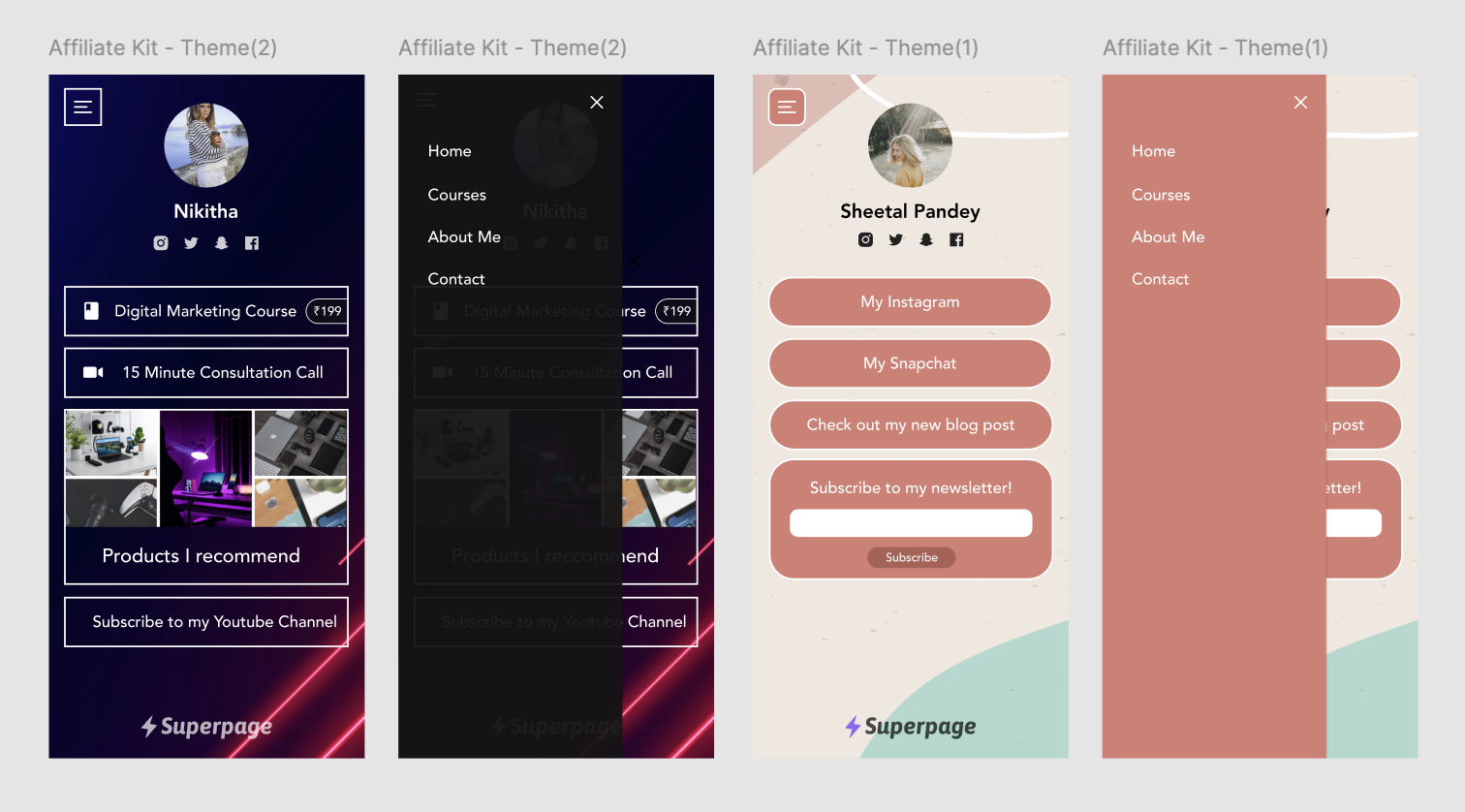
I built Super Page as founder and sole designer — a mobile-optimised link-in-bio platform that grew to 5,000+ creators organically and was acquired by AppX (Y Combinator '21) in under 18 months.
Super Page was born from a personal frustration. In 2020, Instagram's single-link limitation was limiting creators who wanted to share multiple destinations — their store, newsletter, latest video, and social profiles — from a single bio.
Linktree existed, but felt generic and didn't let creators express their brand. I saw an opportunity to build a more designed, customisable, and creator-first alternative — and to build it the way I thought it should work as a designer.
I wore every hat: product strategy, UX research, visual design, brand identity, and marketing assets. The engineering was handled by a single developer I brought in — all direction, scope, and QA came from me.
The product grew entirely through word of mouth and creator communities. No paid acquisition, no growth hacking — just a product people genuinely wanted to share.
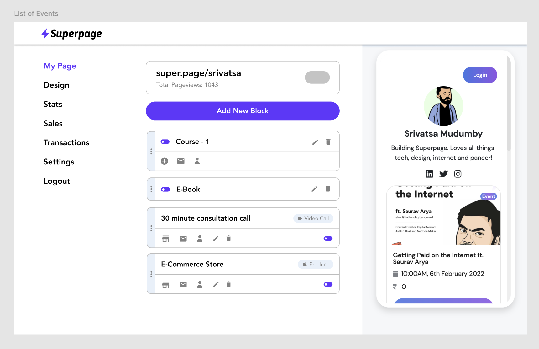
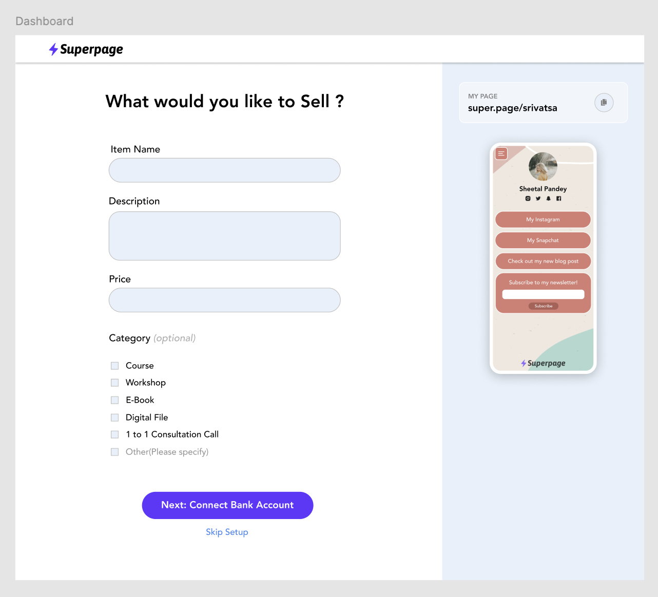
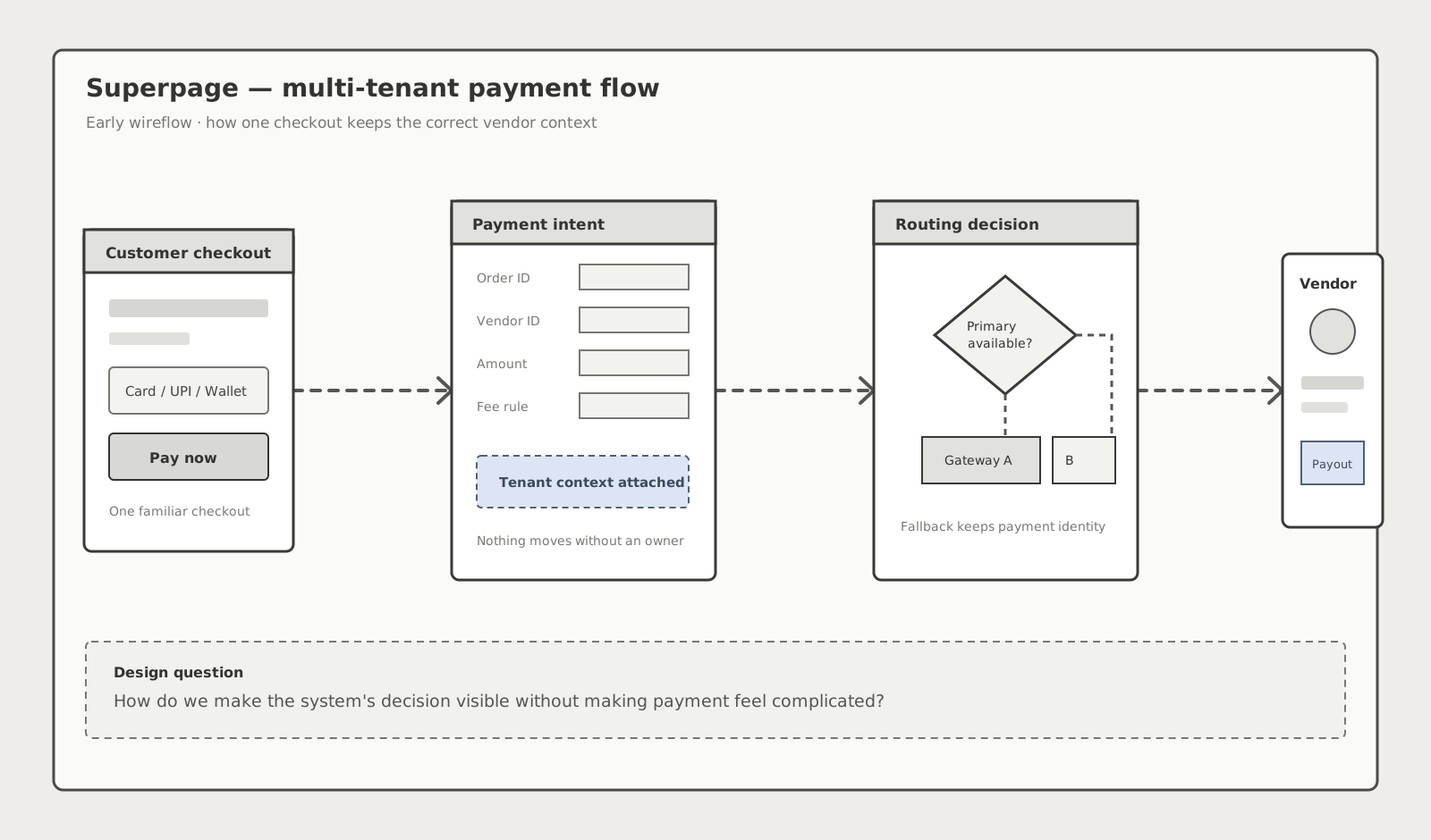
For Superpage, I designed a payment system that accepts money through one checkout, preserves vendor ownership, applies platform fees, selects a gateway route, and keeps settlements traceable from end to end.
Superpage helped creators publish storefronts and sell digital products directly to their audiences. Once multiple creators could receive payments through the same platform, a simple checkout became a multi-tenant money movement problem.
Every purchase had to remain connected to the correct vendor, fee agreement, gateway route, refund history, and settlement record—without exposing that complexity to the customer.
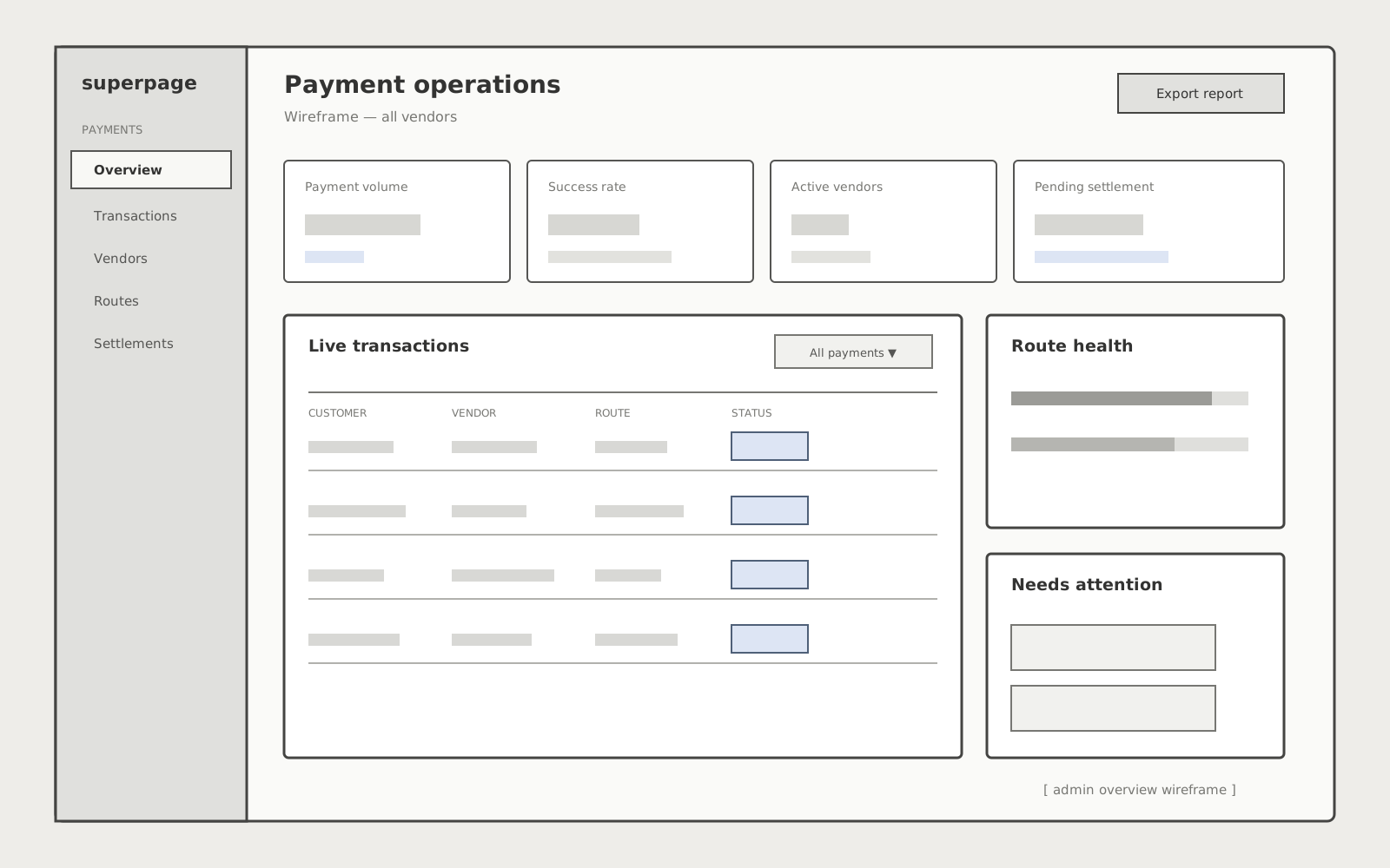
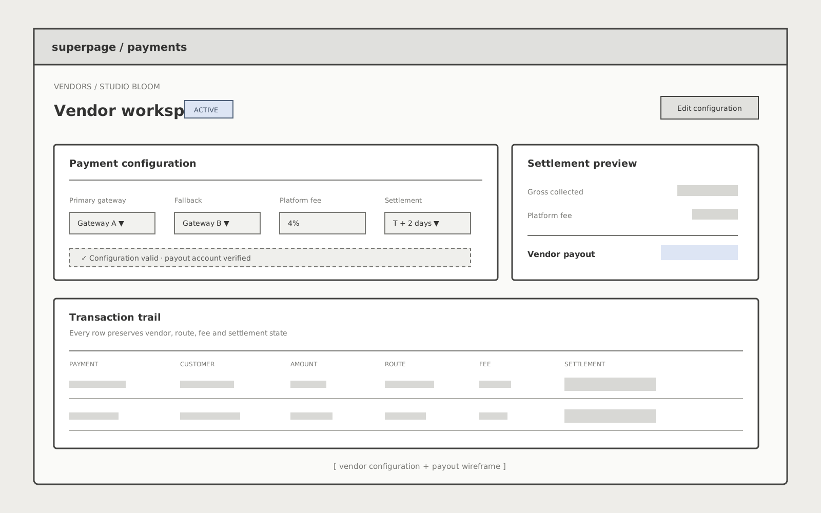
I led the product design across three connected perspectives: the customer completing payment, the vendor tracking earnings, and the Superpage operator resolving gateway failures and settlement issues.
My mandate: define a shared payment model, map the critical edge cases, and turn the system into testable wireflows before visual design or engineering implementation.
Started with a service blueprint that followed one payment from checkout to vendor settlement. Mapped system events, ownership changes, gateway responses, fee calculation, refunds, and operator interventions.
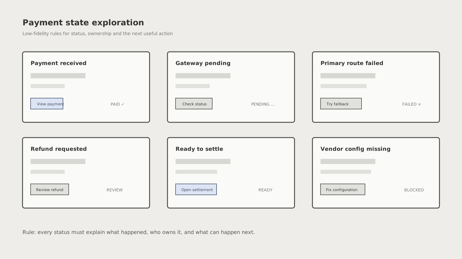
Aligned customer-facing language, vendor status, admin status, and backend events around one state matrix: initiated, pending, paid, failed, refunded, blocked, and settled.
Built low-fidelity wireflows for customer checkout, vendor earnings, and Superpage operations. Keeping the work intentionally rough helped the team debate logic and hierarchy before visual polish.
Worked through gateway timeouts, fallback routing, incomplete vendor setup, partial refunds, payout holds, and reconciliation mismatches. Each state had to explain what happened and what could happen next.
Reviewed wireflows against gateway behaviour and backend events, resolved ambiguous states, and annotated the expected data and actions for each surface before handoff.
The wireframes gave Superpage a shared operational model before visual design began. Product and engineering could review the same payment states, ownership rules, and recovery paths without getting distracted by surface styling.
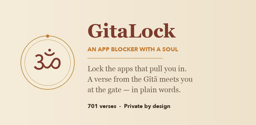
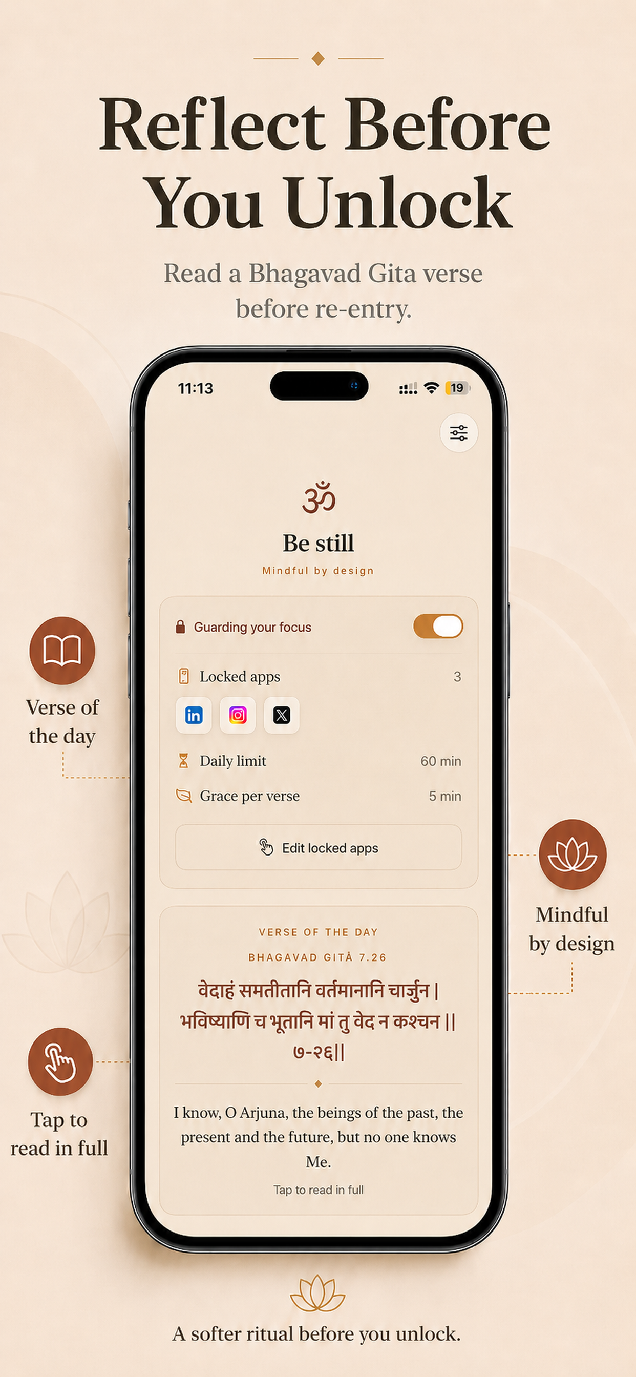
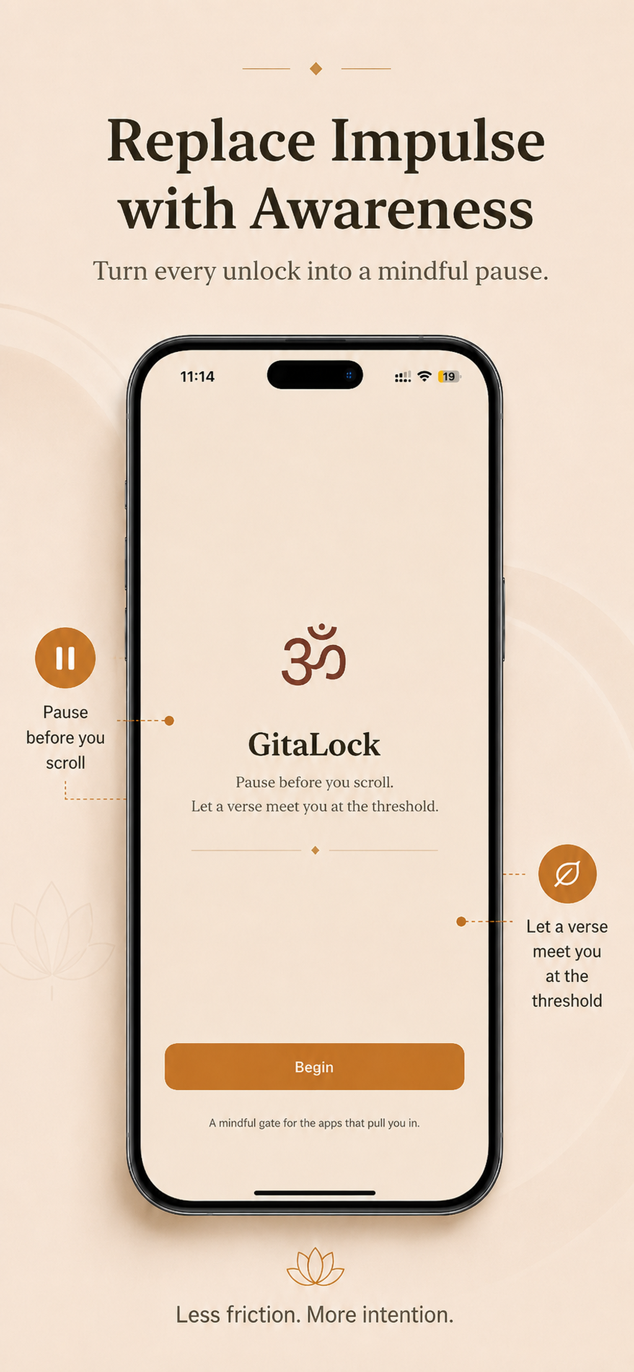
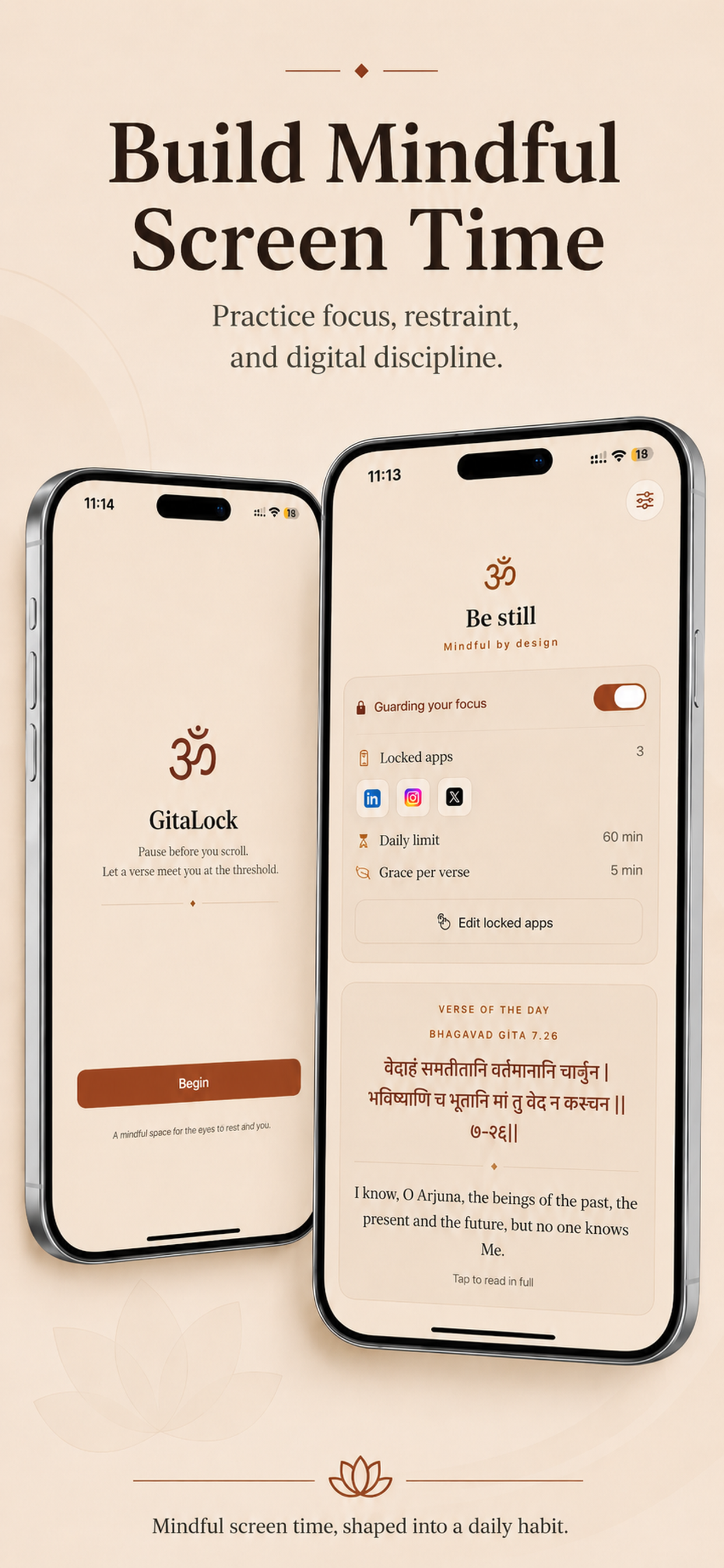
GitaLock turns an impulsive app open into a mindful decision. When a daily limit is reached, a verse from the Bhagavad Gītā appears at the gate—helping the user pause, reflect, and choose how to spend the next few minutes.
View on the App Store ↗Most app blockers treat distraction as a discipline problem. They add a hard wall, but do little to change the reflex that brought the user there.
GitaLock reframes the blocked moment as a point of reflection. Instead of punishment, the experience offers a calm interruption grounded in timeless guidance.
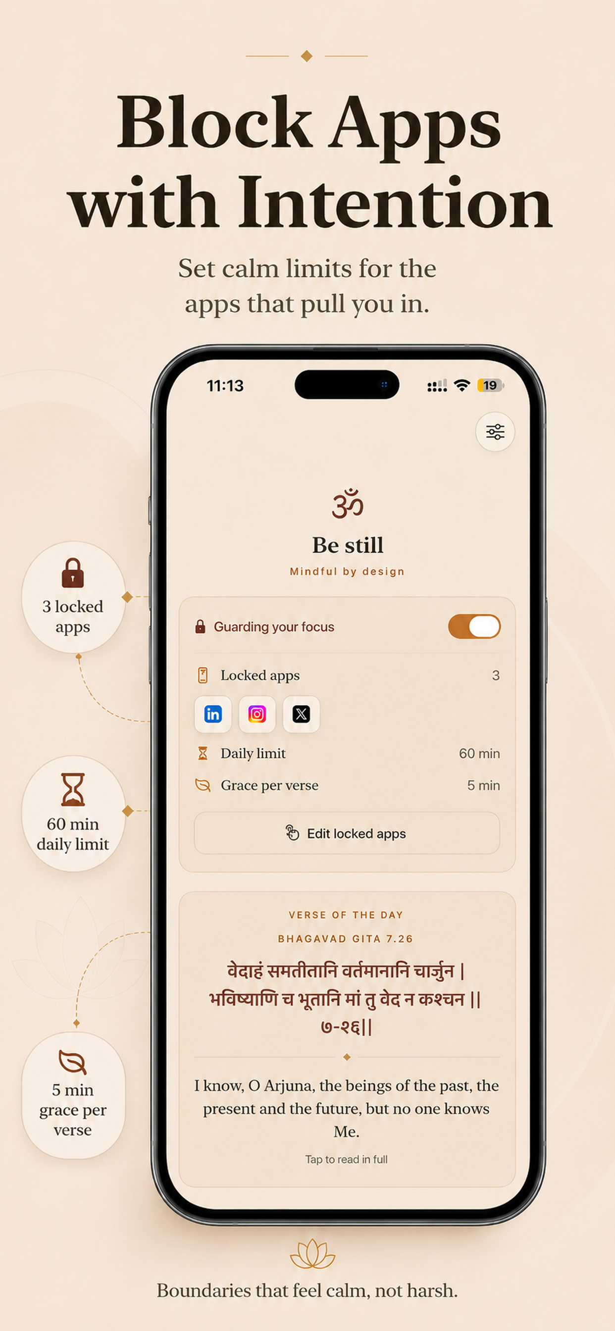
Users choose the apps that pull them in, set a daily time budget, and optionally add bedtime or focus schedules. When the limit is reached, GitaLock presents a verse and its meaning before offering a deliberate next choice.
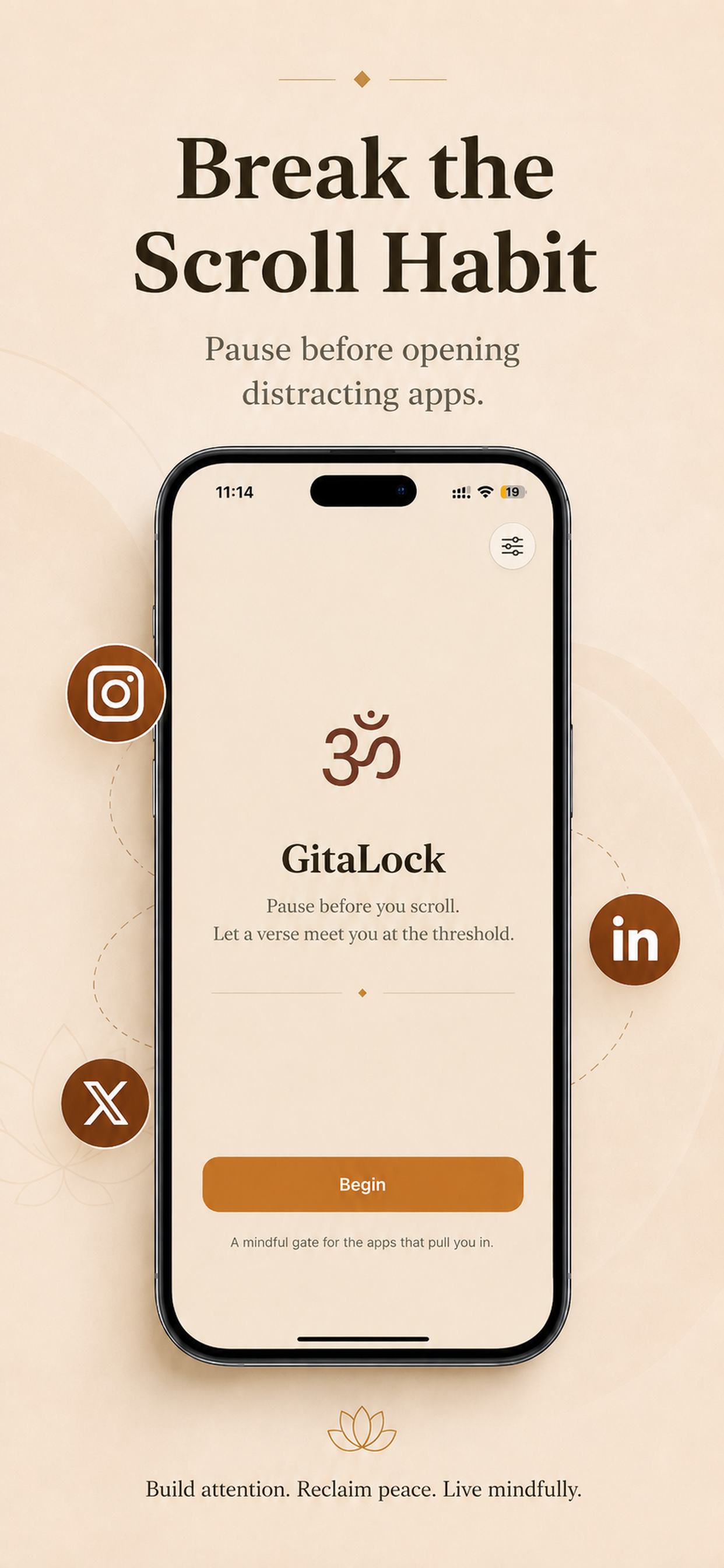
The experience moves from intention to interruption to reflection. Each screen reinforces the same calm promise while making limits, protected apps, and the next available action easy to understand.
The App Store story follows that same journey: establish the habit problem, show how boundaries work, then reveal the verse-led pause that makes GitaLock different.
The visual language avoids the cold, clinical patterns common to productivity tools. Cream paper, saffron, deep maroon, serif typography, and generous spacing make the experience feel contemplative rather than restrictive.
Verses are presented in Devanāgarī, transliteration, a classic English translation, and a plain-language meaning so the pause remains useful to both familiar and first-time readers.
Privacy is part of the product experience: no account, no tracking, and no data collection. App selections remain on-device and Apple’s Screen Time framework handles the protected system state.
The interface gives users agency through clear limits, understandable schedules, and a reversible grace period—firm enough to interrupt habit, but never punitive.